Marigold Spice Company
A pan-Indian visual narrative rooted in place, flavour and authenticity.
Industry
FMCG
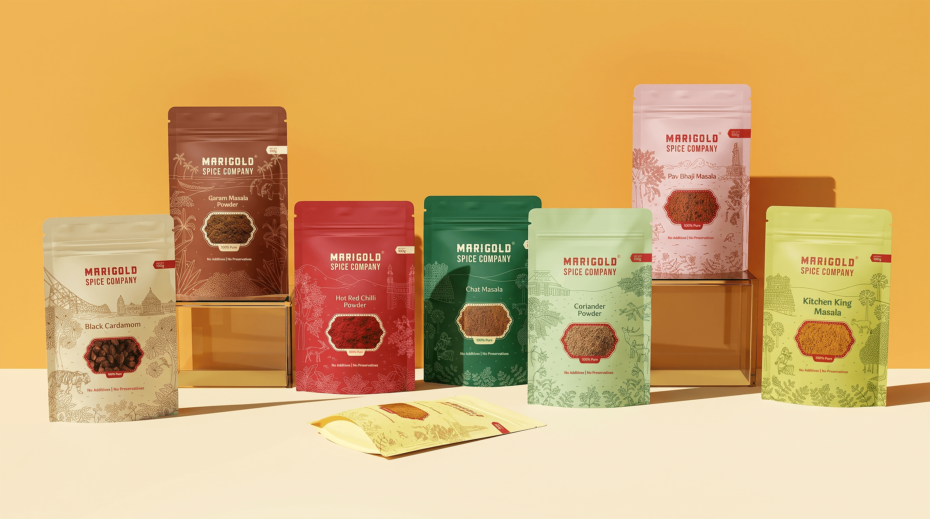
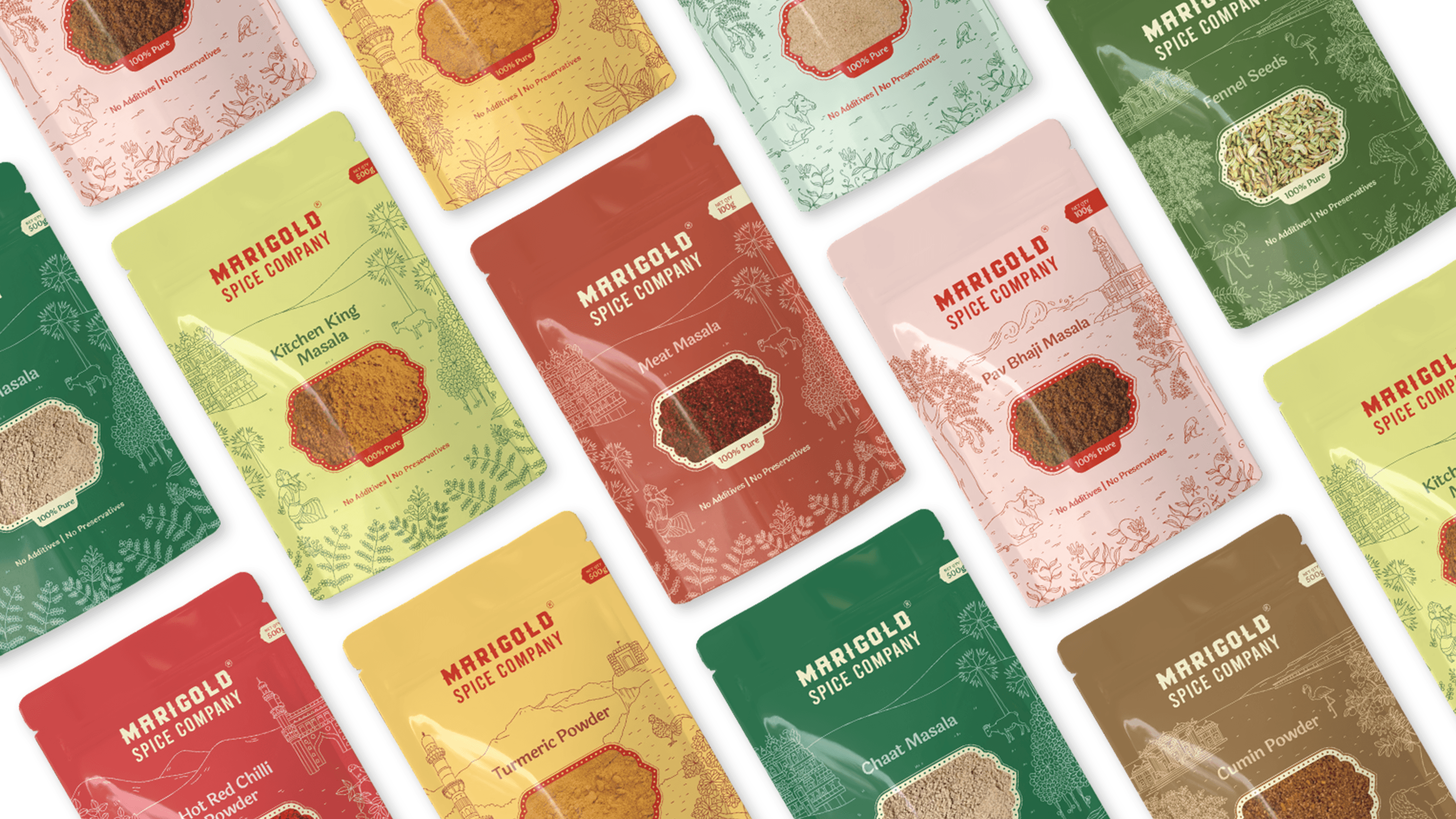
Marigold Spice Company’s philosophy has always been rooted in the idea of home. Sourced from small farmers and producers across different corners of India, their spices carry the aromas and stories of the regions they come from. The brief was to design a packaging system that felt authentically Indian and stood out on shelves in international markets. It was essential to give each spice its own regional identity while maintaining one unified identity across dozens of SKUs and pack sizes.
Scope of Work
Packaging Design, Conceptualisation, Illustration, Colour Testing, Artworking
Sourced from All Corners of India
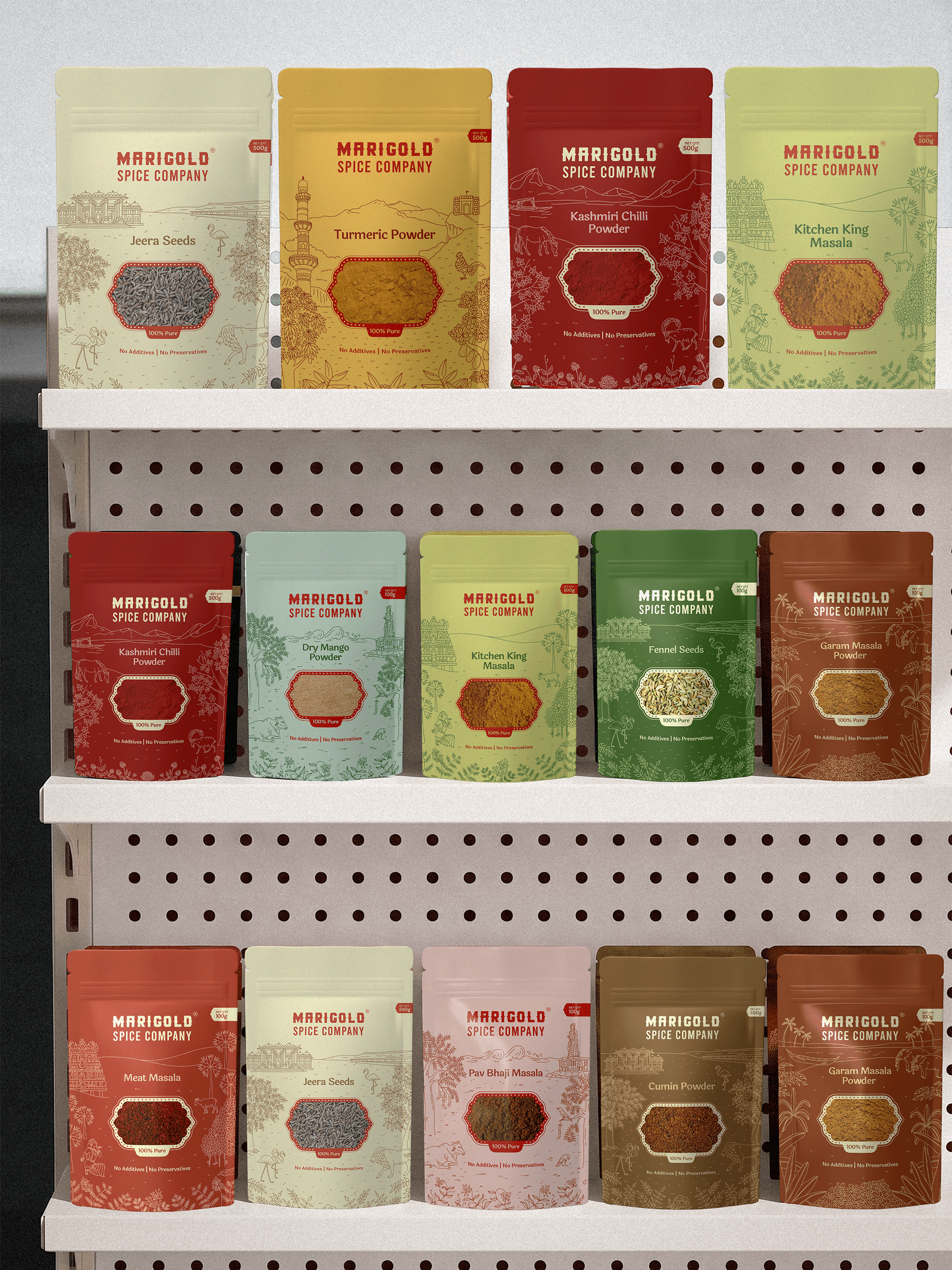
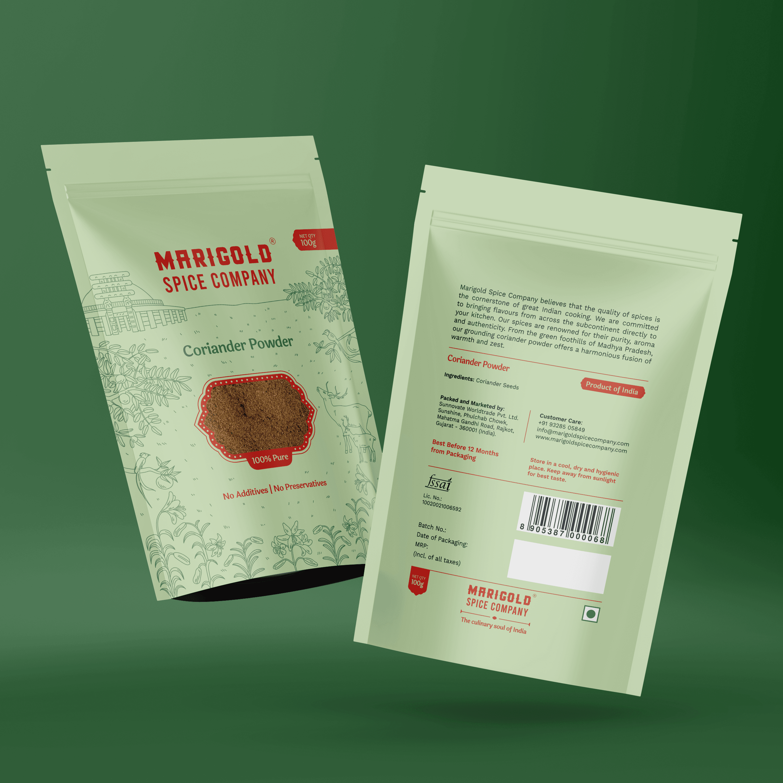
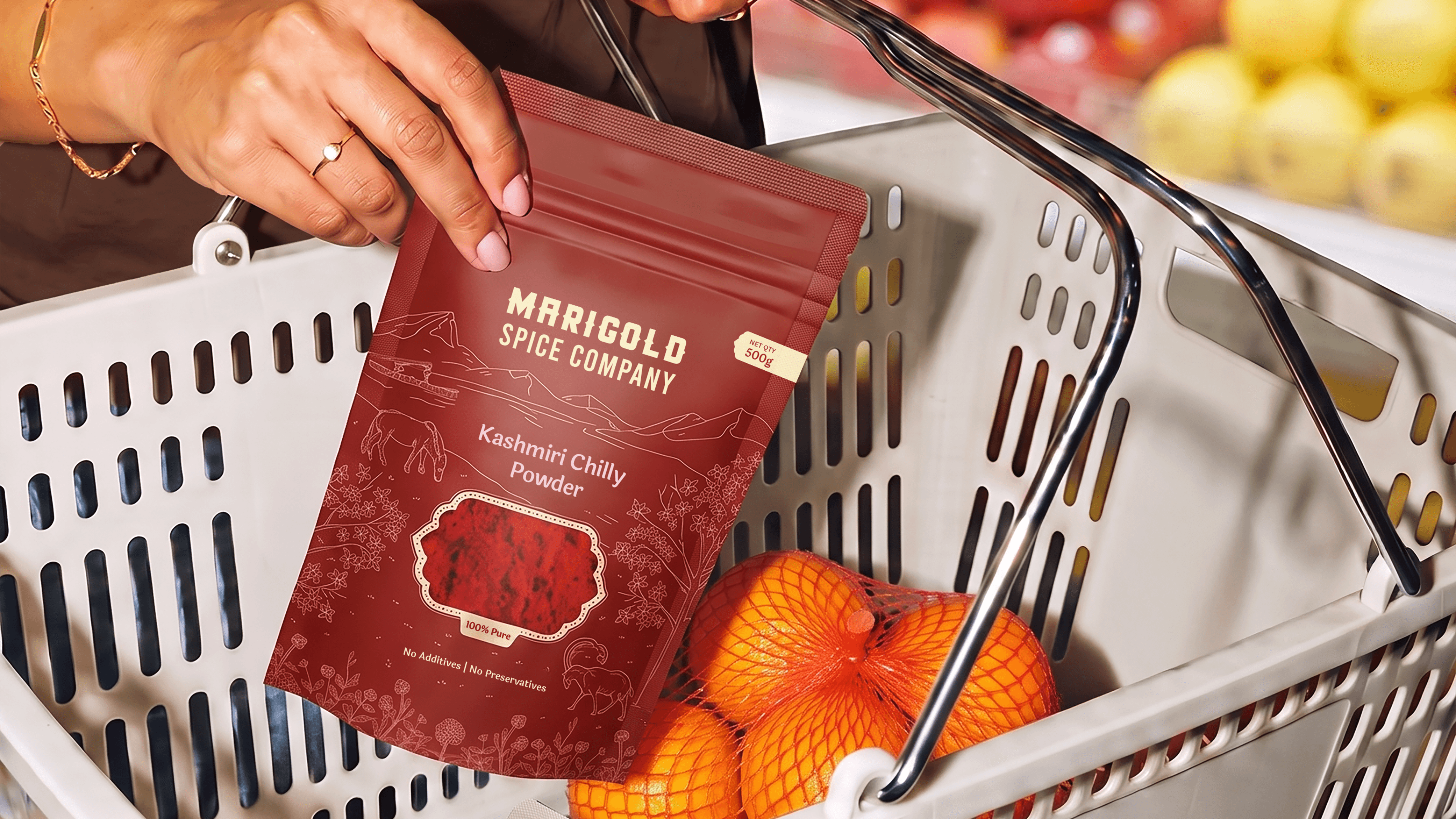
The illustrations on each pack artfully represents the region the spice is sourced from: local landmarks, native animals and their flora. Kashmiri Chilli powder has the Himalayas and Ibex, coriander powder has the deers and lilies of Madhya Pradesh, garam masala embodies the backwaters of Kerala and so on. It was vital for the regional story to be part of the product to resonate with local audiences and differentiate itself within global markets.
Elevated Heritage
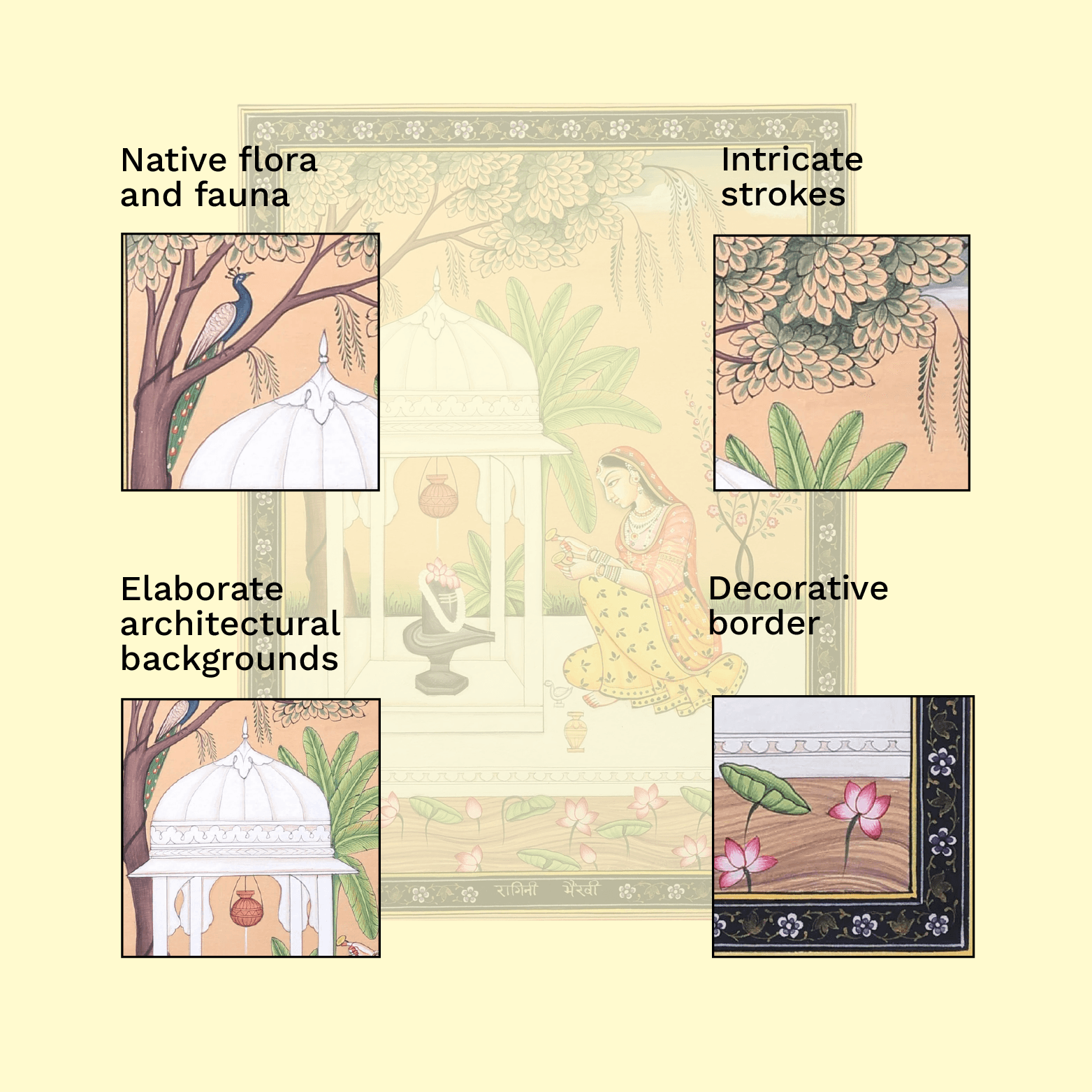
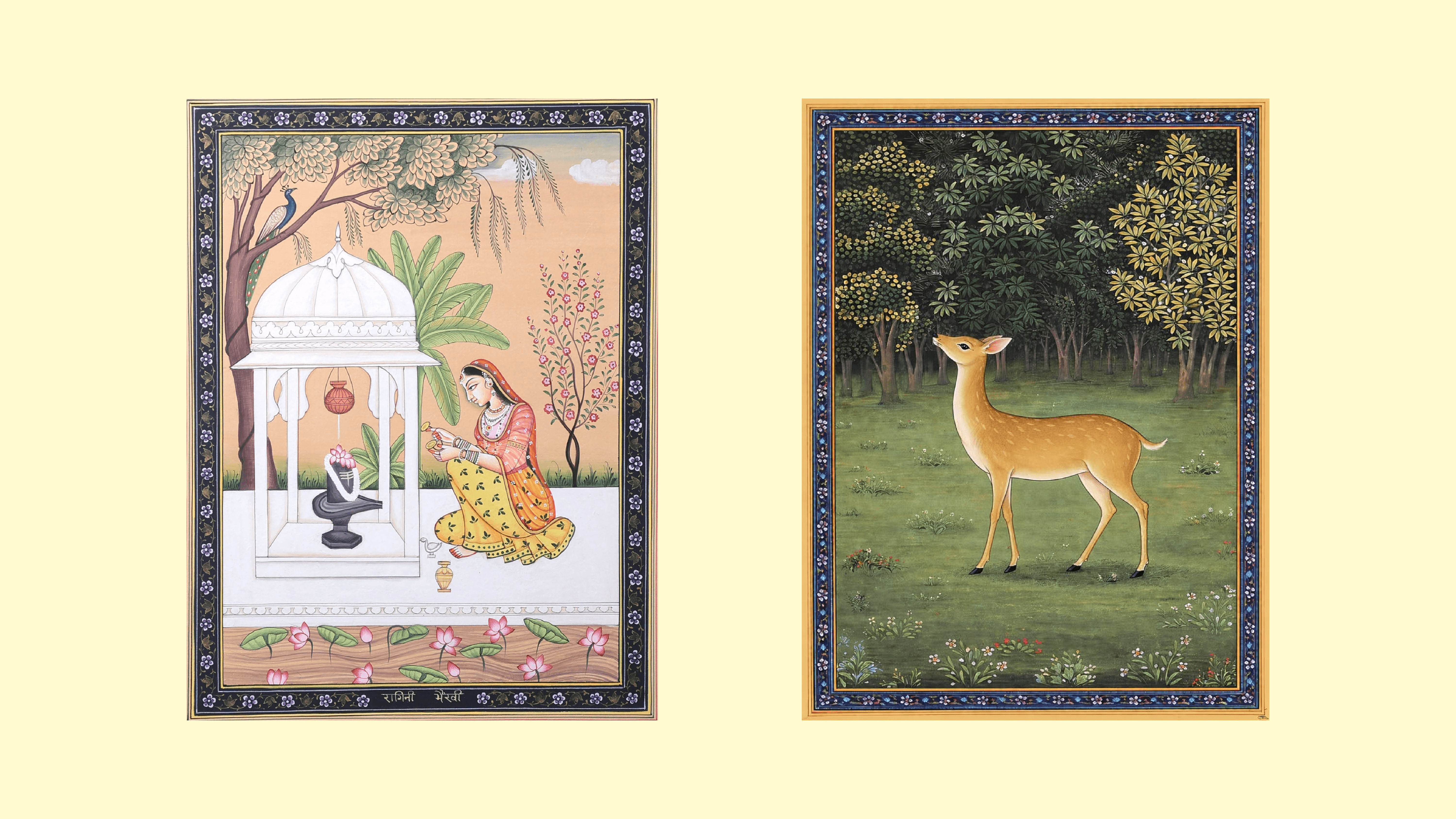
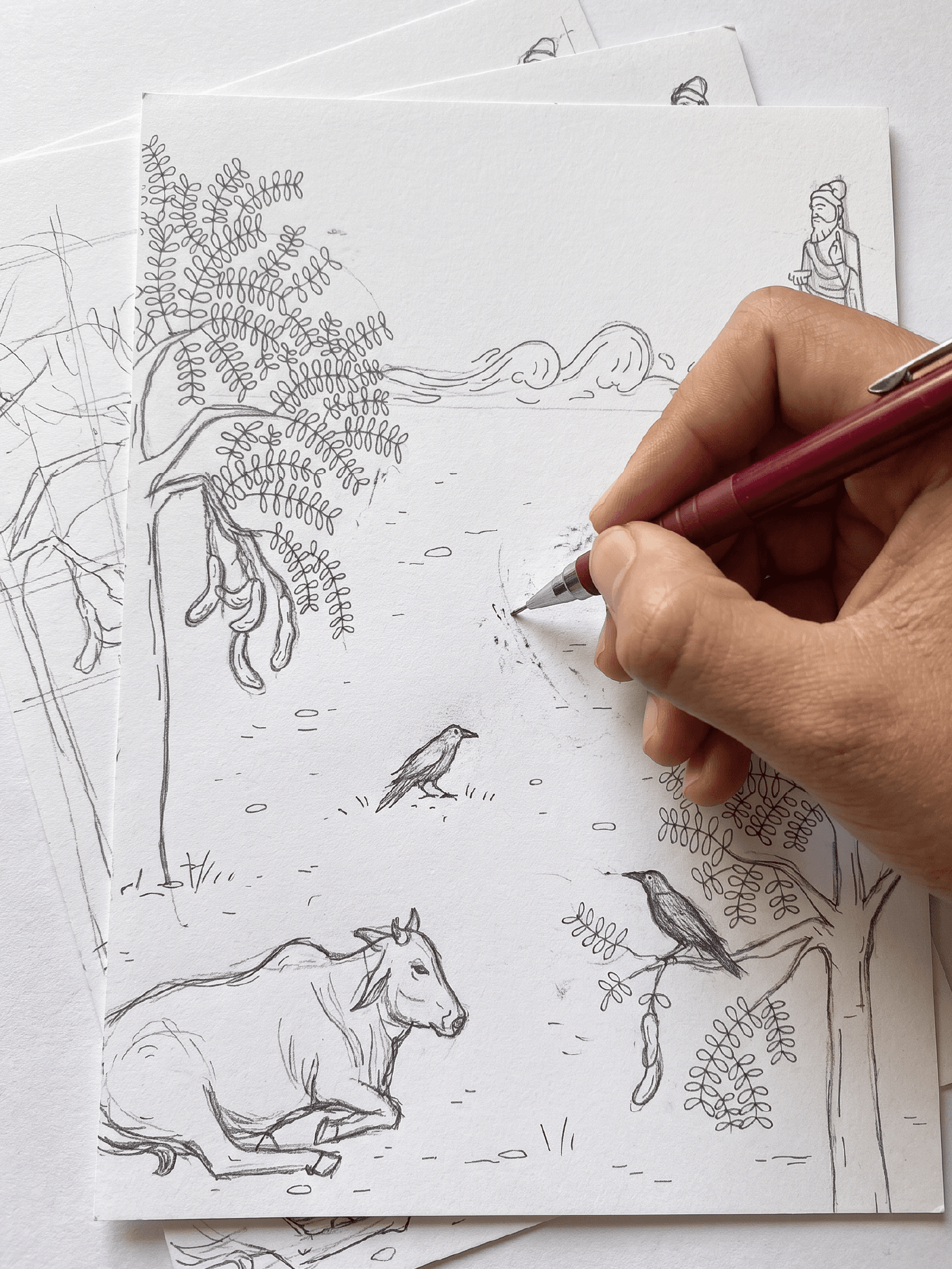
The illustration style draws from traditional Pahari miniature paintings. Intricate line work, local biodiversity, elaborate architectural motifs and ornamental borders were anchored in the design system. Our process began with hand sketching which was refined and then adapted as flat vector illustrations. They were intentionally designed to bring movement and vibrancy when set against different solid coloured backgrounds across the entire collection.

Built to Scale
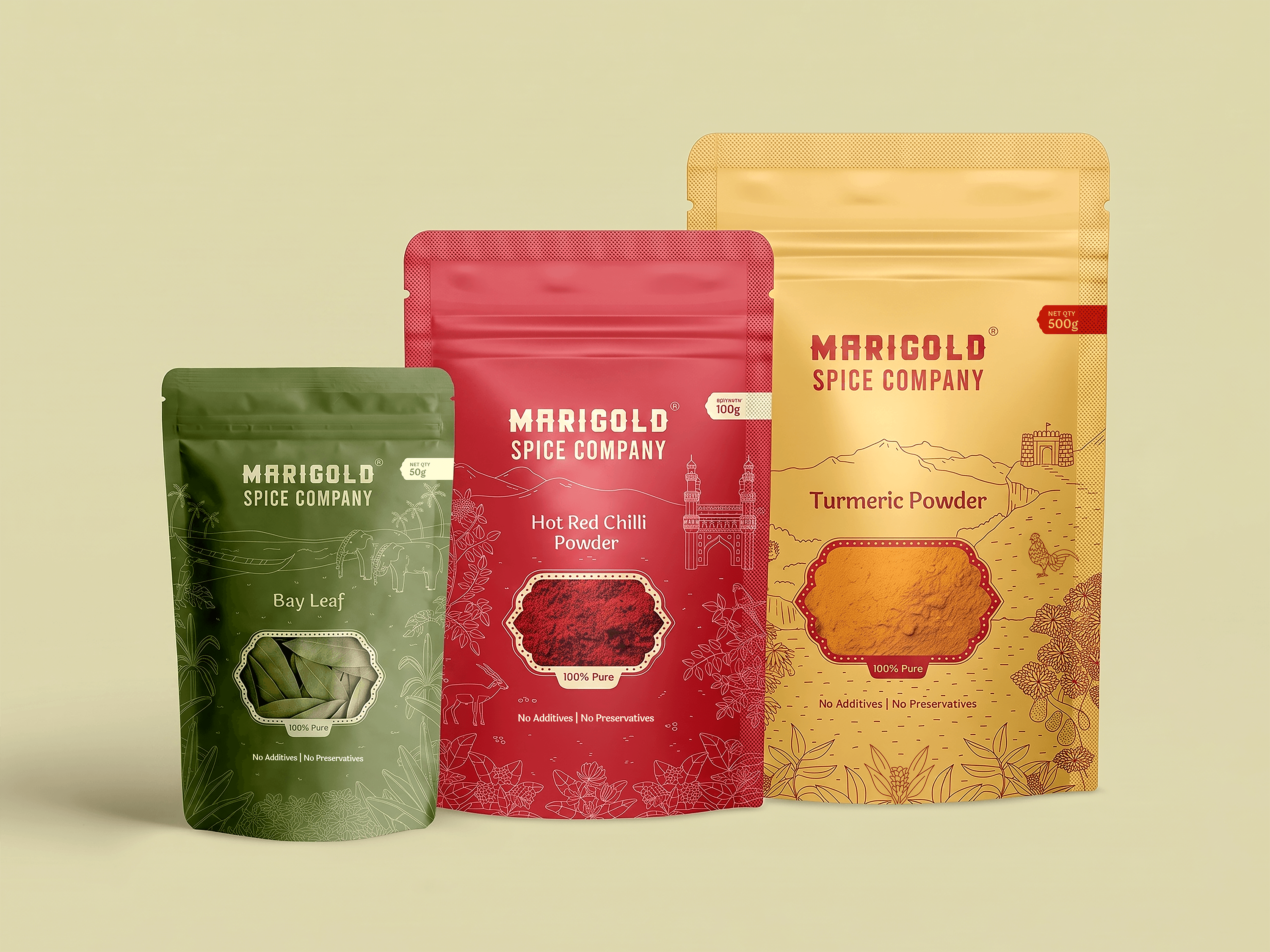
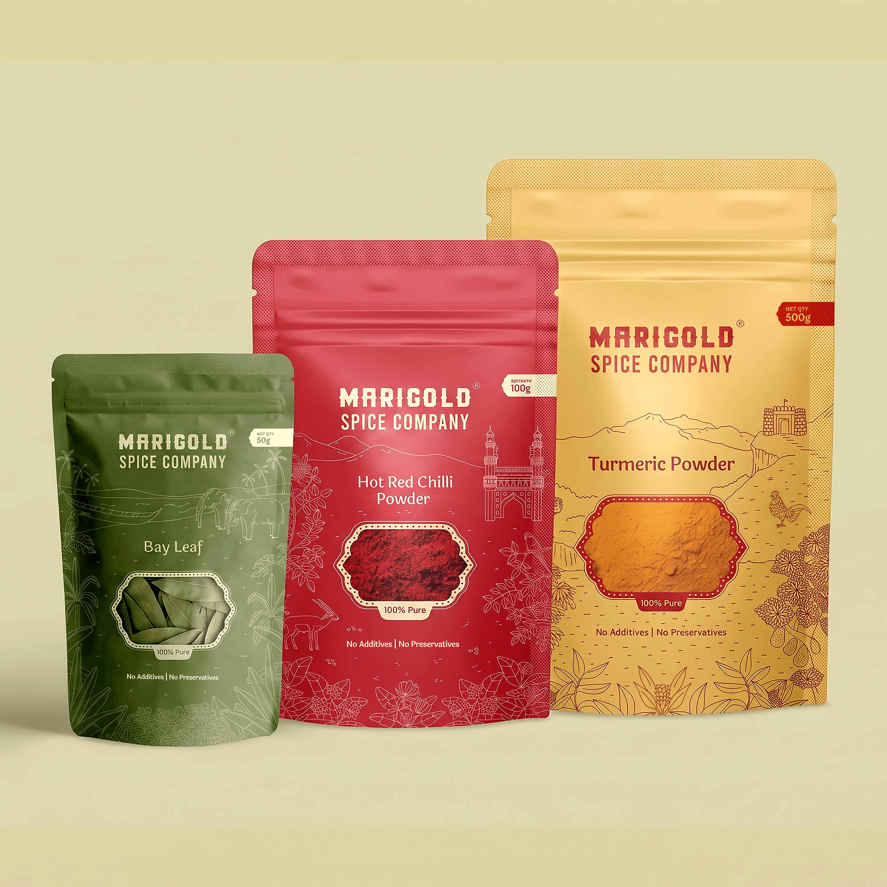
The design system was engineered to seamlessly accommodate different packaging sizes (50g, 100g, 500g) without compromising its identity. Each pouch maintains the same structure: brand lockup at the top, a die-cut window to showcase the actual spice and the regional illustration centrally framed and scaling effortlessly from, a small bay leaf pouch to a large turmeric bag.
Tasting Authenticity
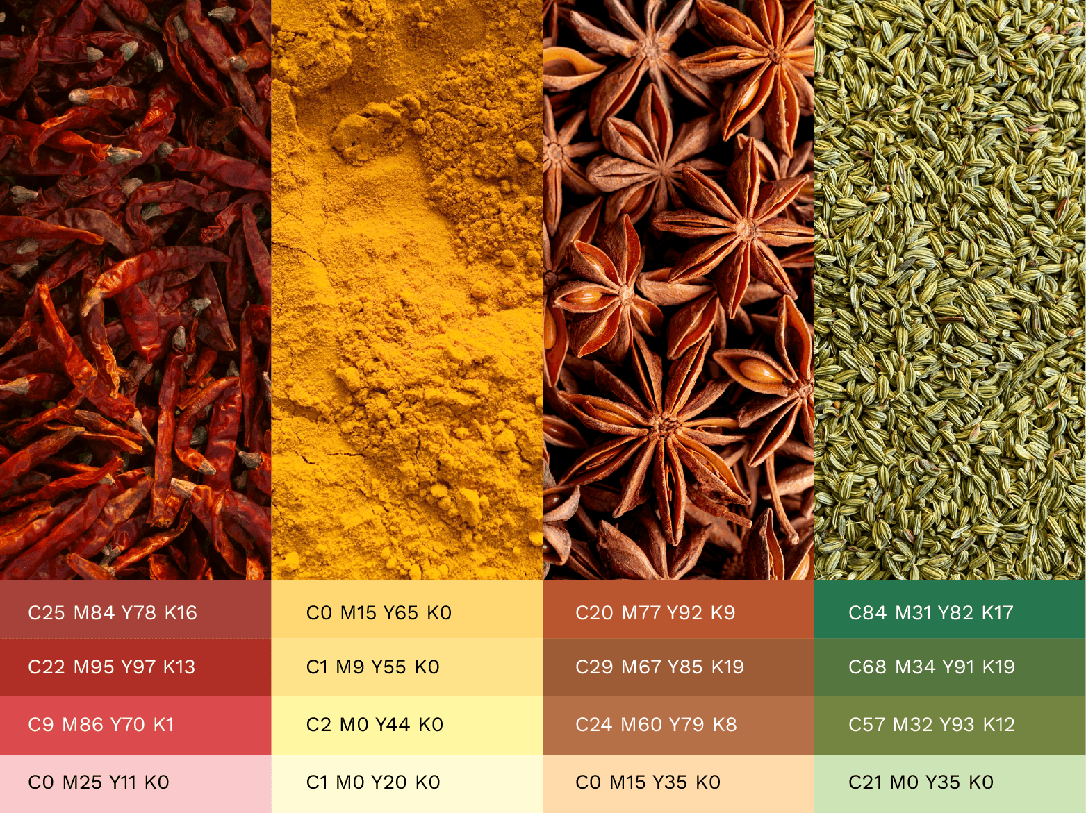
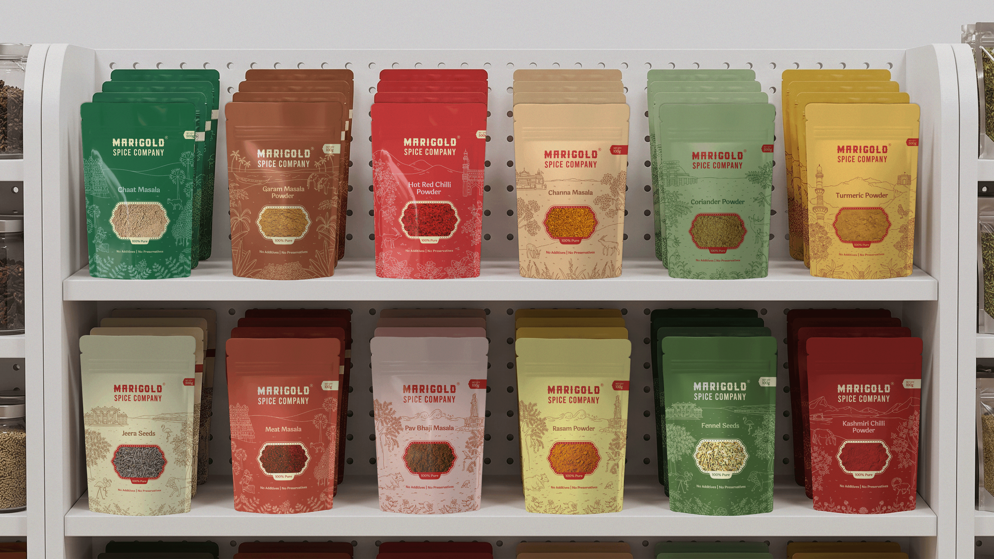
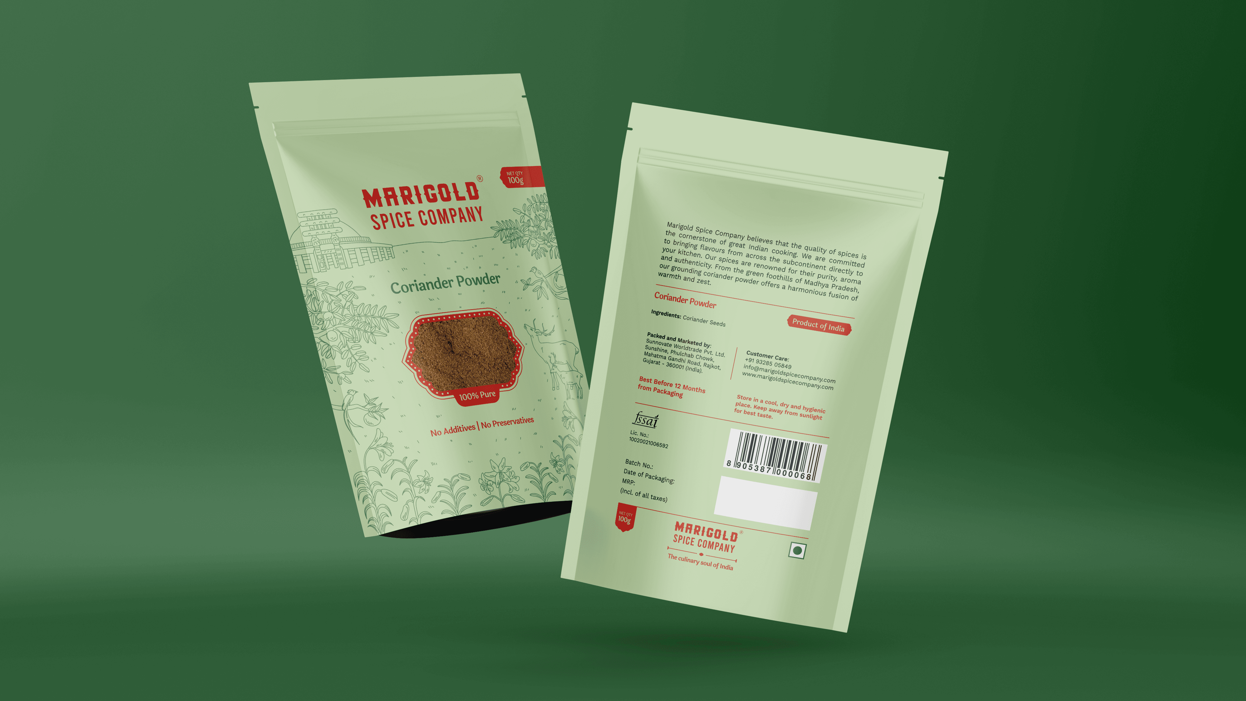
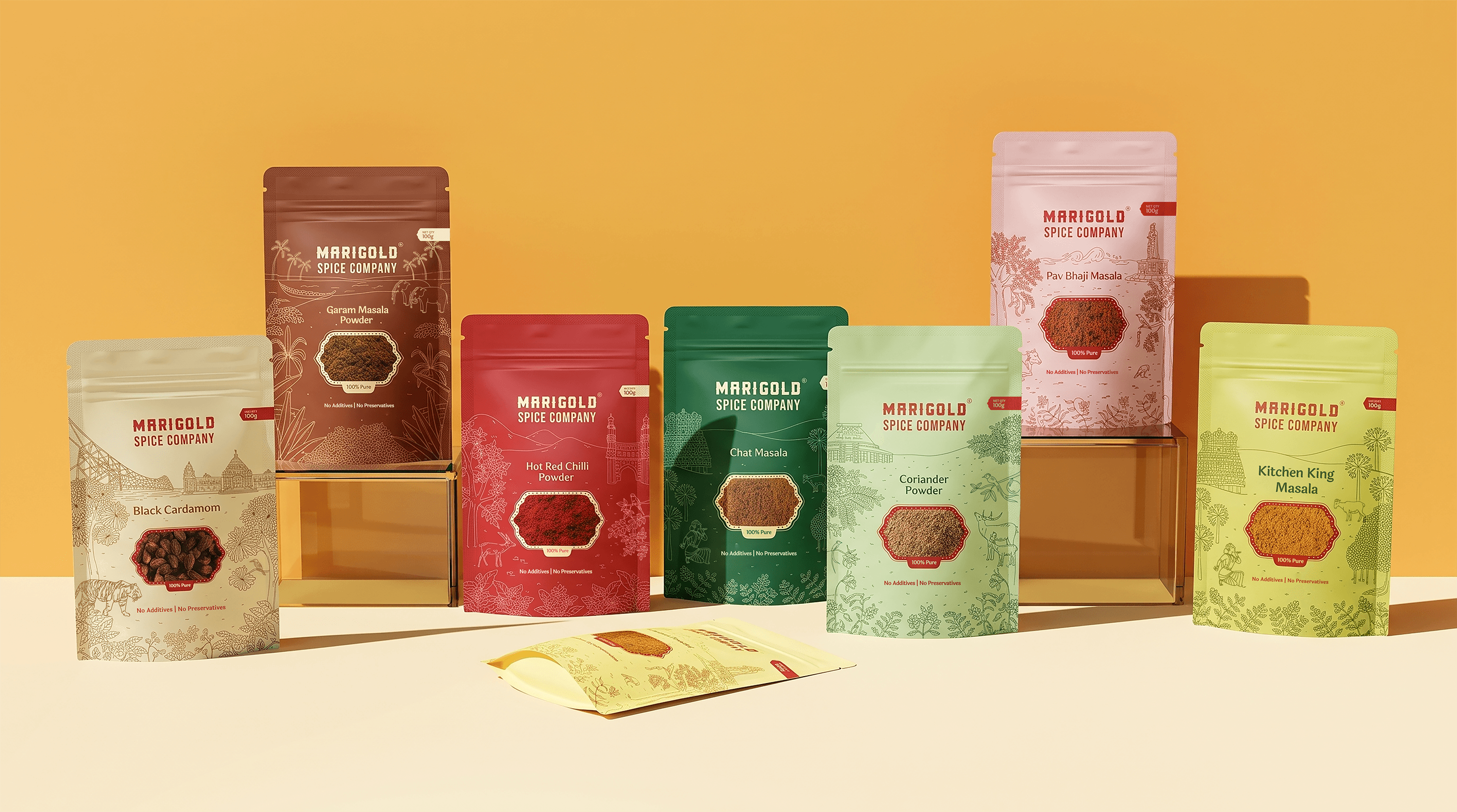
The brand’s promise is placed on both the front and back of each pouch. Mandatory FMCG compliance is neatly integrated on the back using the same cohesive visual language. Each spice has its own unique colourway, however, the entire lineup remains unmistakably part of the Marigold family.
Outcome
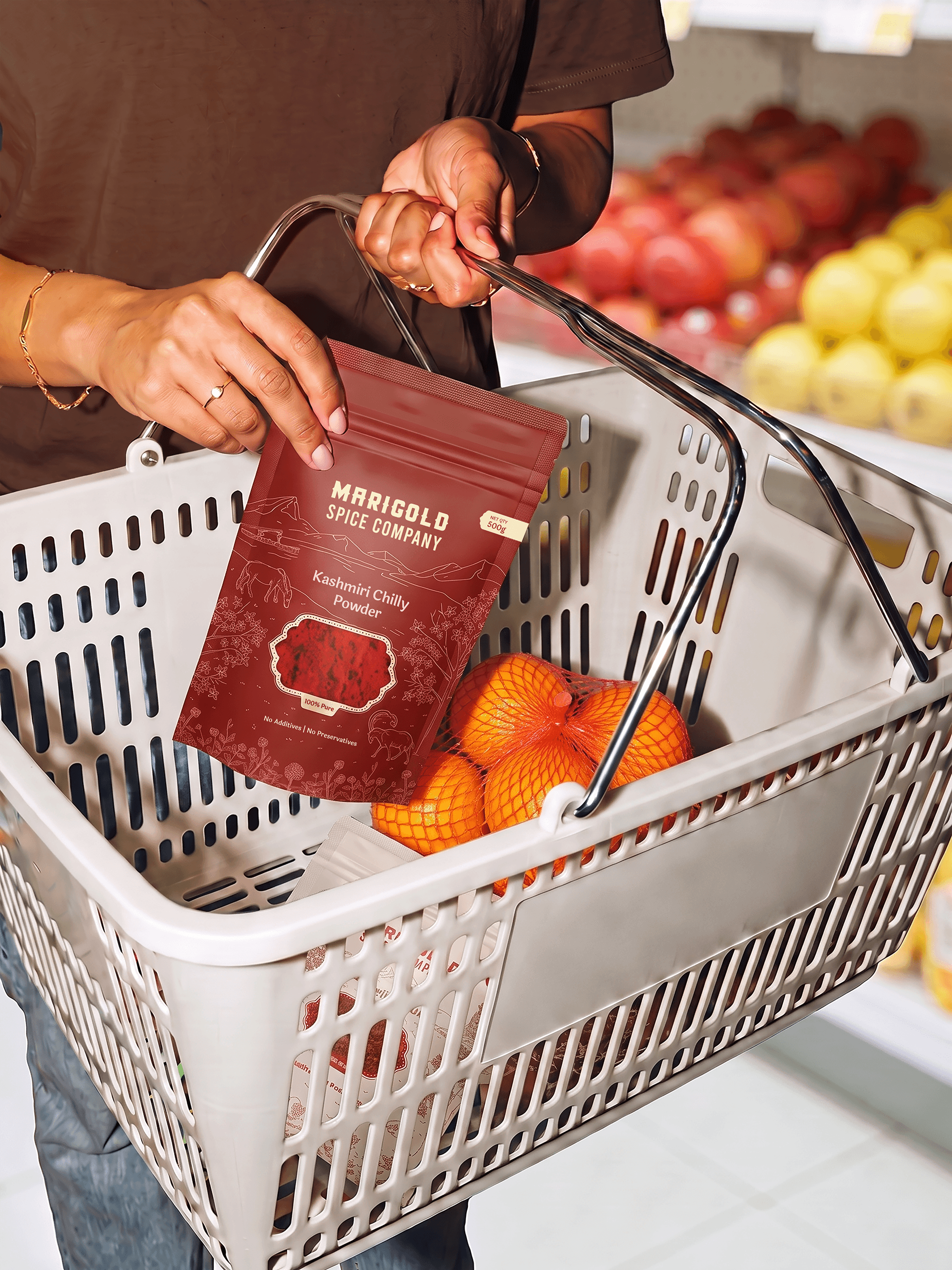
Marigold is naturally positioned as an authentically Indian brand as the packaging system transforms the spice aisle into a journey across India. With most of Marigold’s products being exported to international shelves, the illustrations translate India's culinary heritage into a globally accessible visual language that consumers can connect with instantly.
Thanks to
Anushkha Advani, Hitesh Bhanushali, Rhea Shanghvi, Karthika Viju, Kritika Arya