The Mindful Foundation
Narrative illustrations with a youthful approach to mindfulness for the modern workforce.
Industry
Health & Wellness
The Mindful Foundation is a non-profit whose mission is to reshape conversations around mental well-being in India. Combining education with evidence-based sessions developed by the University of Oxford, seeking to cultivate an immersive experience. India’s mental health landscape can be challenging, with lingering stigma attached. Our goal for the brand identity was to playfully capture the essence of mindfulness: calm, focus and inner peace with a youthful energy and approachability. Striking a balance between playful visuals and clear communication of the Foundation’s mission was crucial in order to be inclusive.
Scope of Work
Brand Identity, Editorial Design, Mascot Design, Illustration, Storytelling
Logo
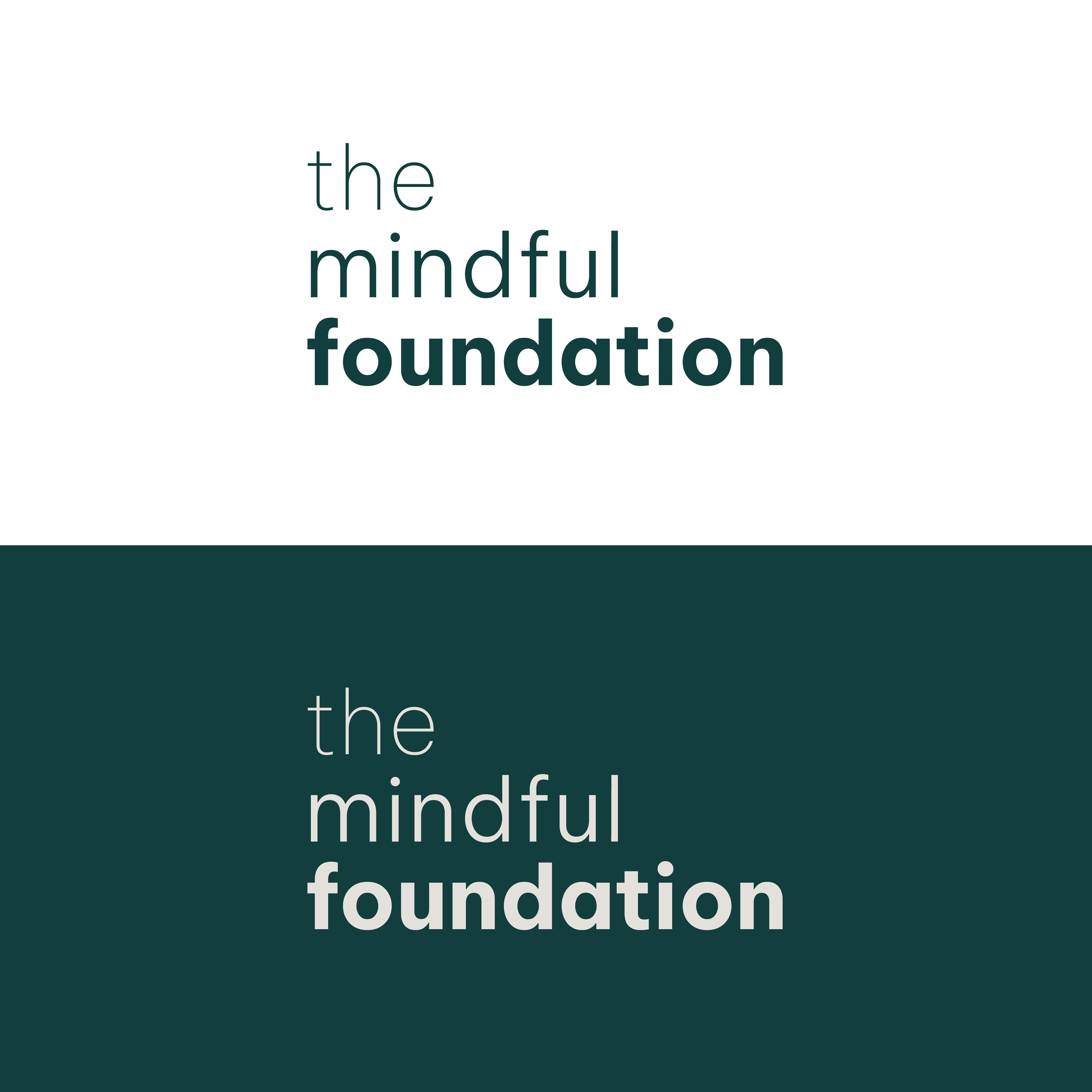
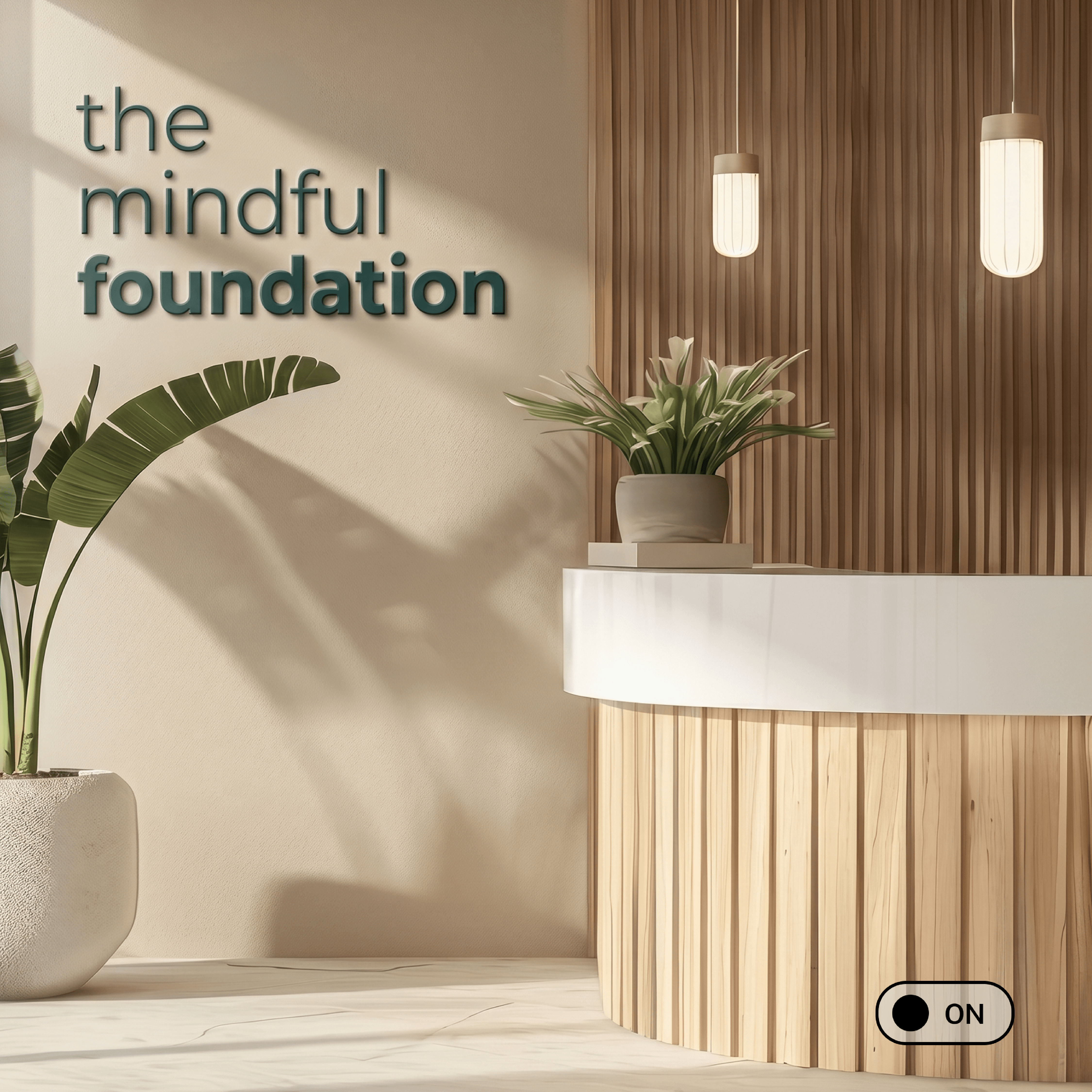
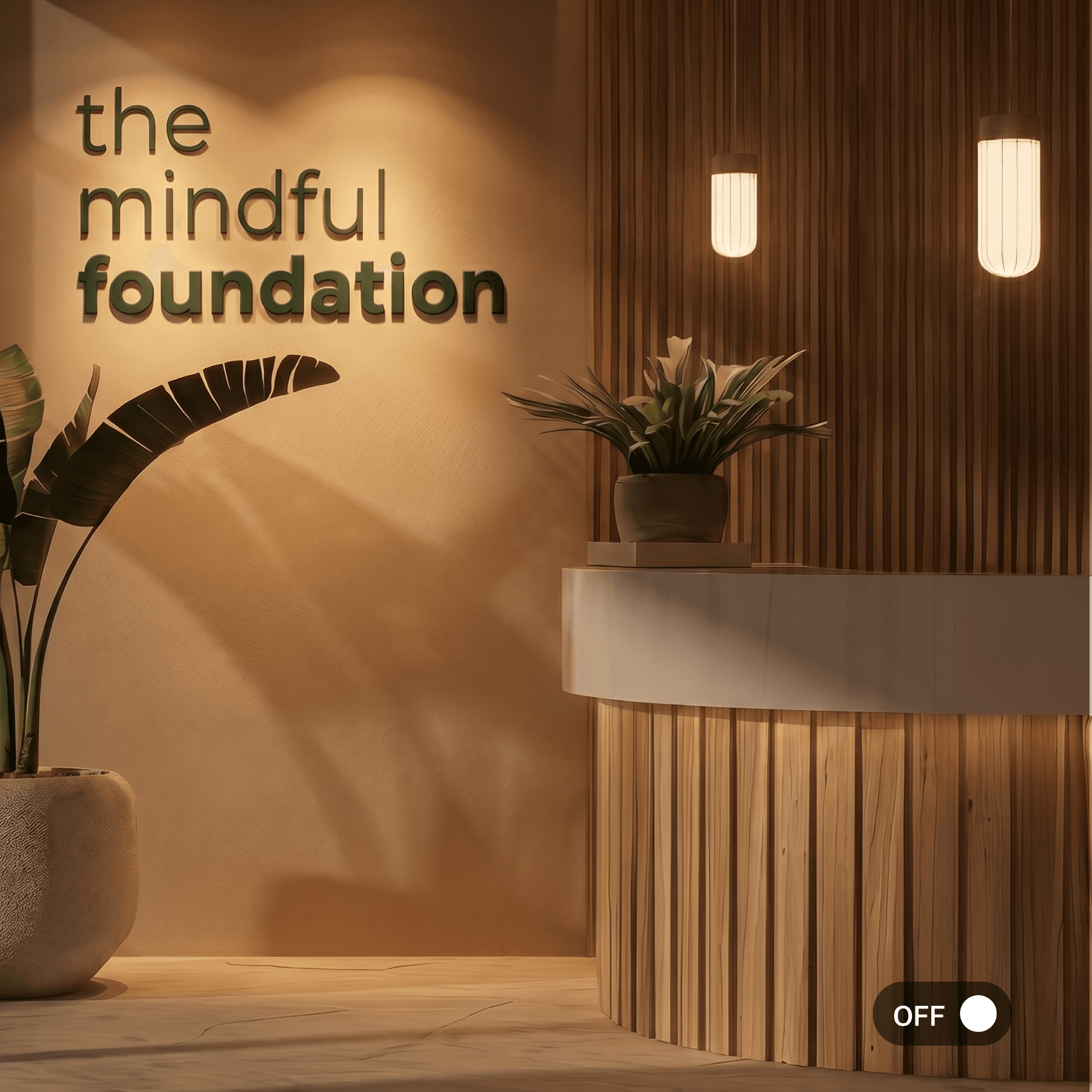
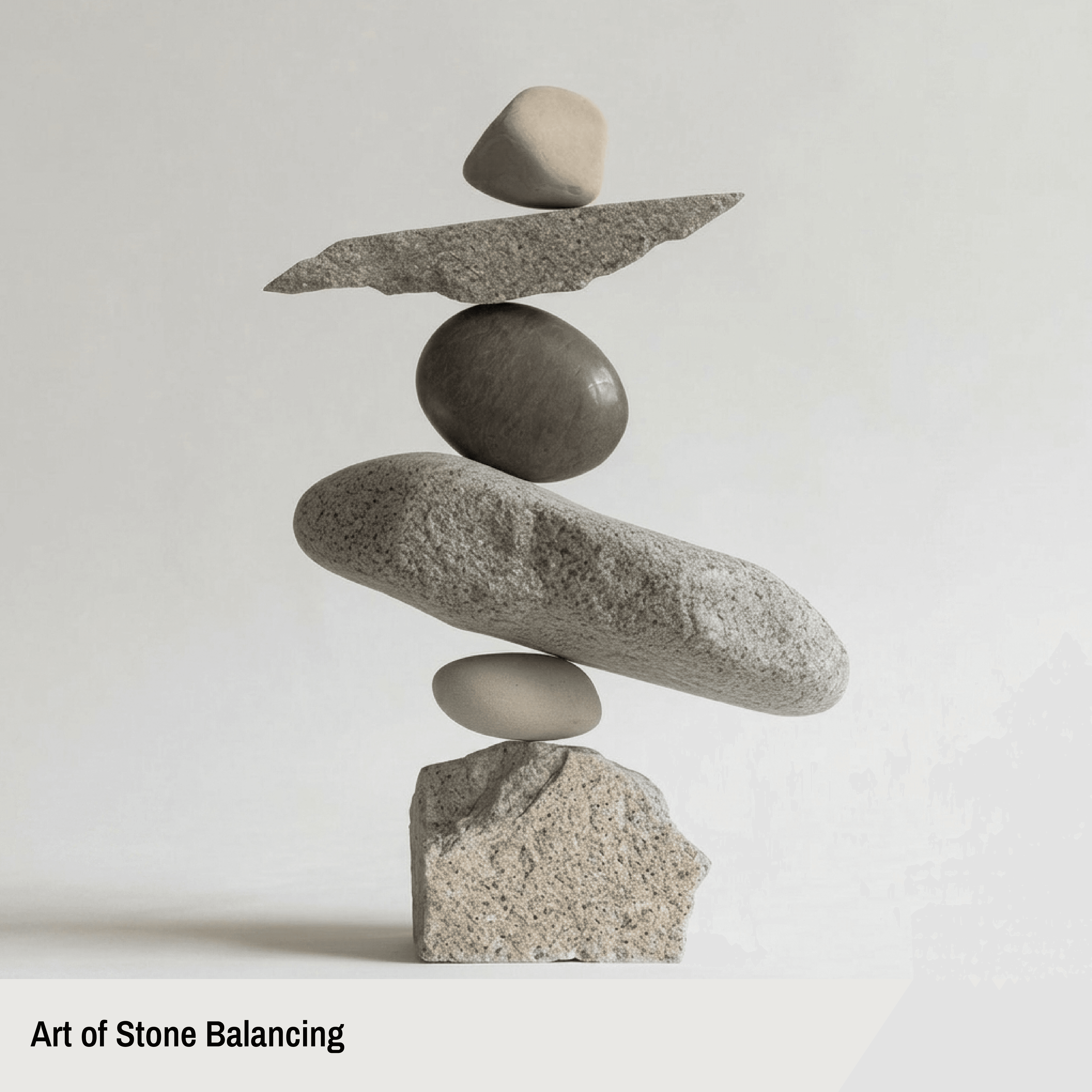
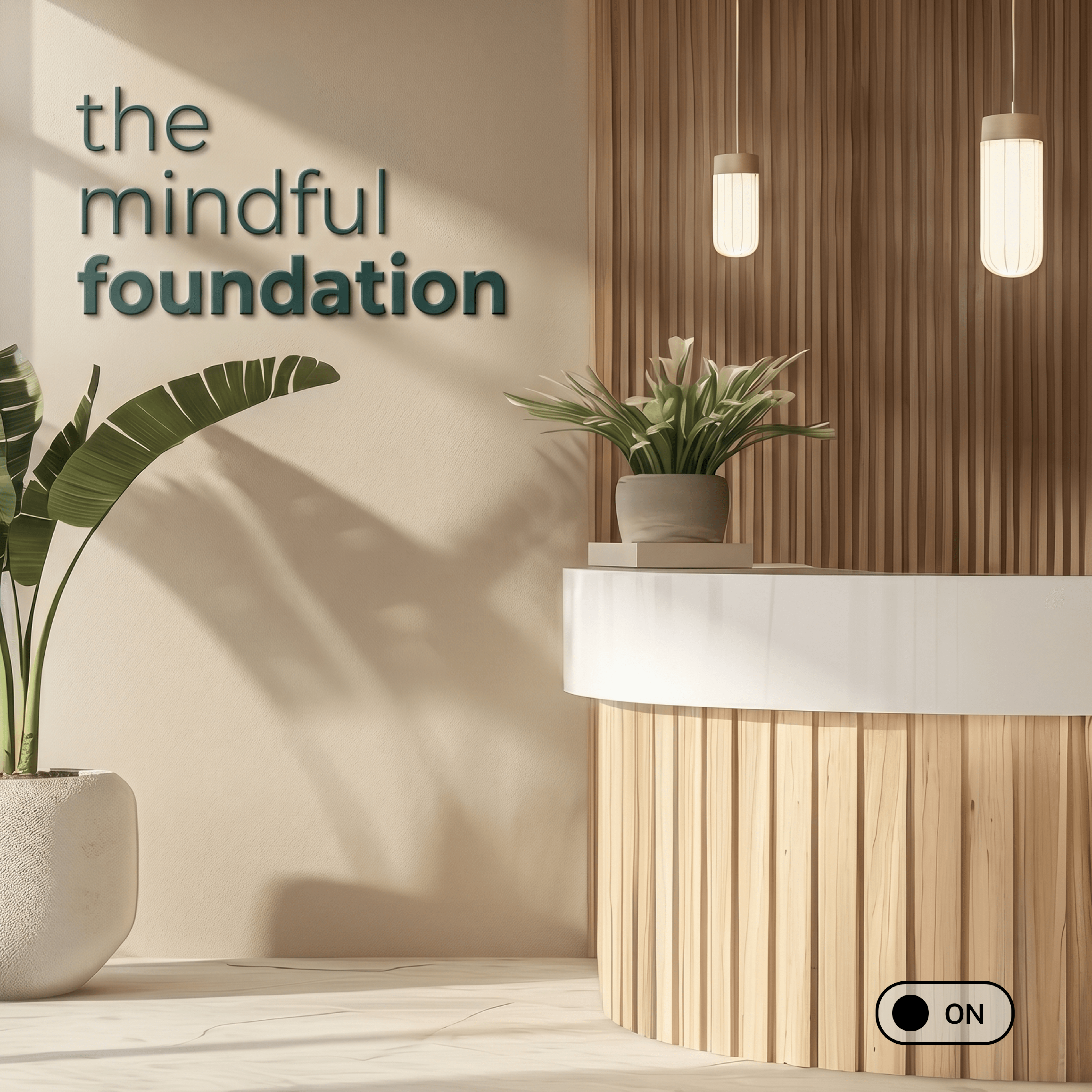
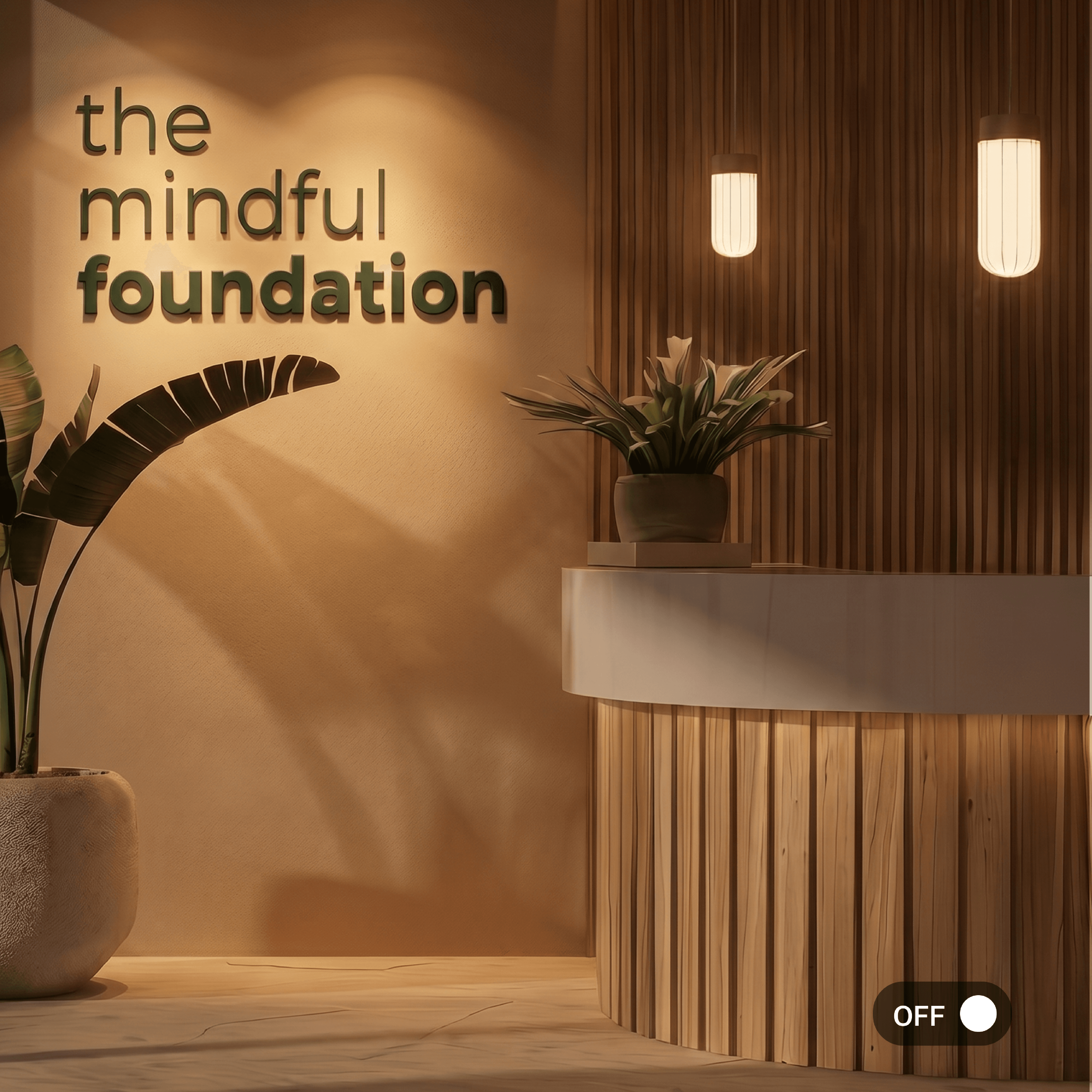
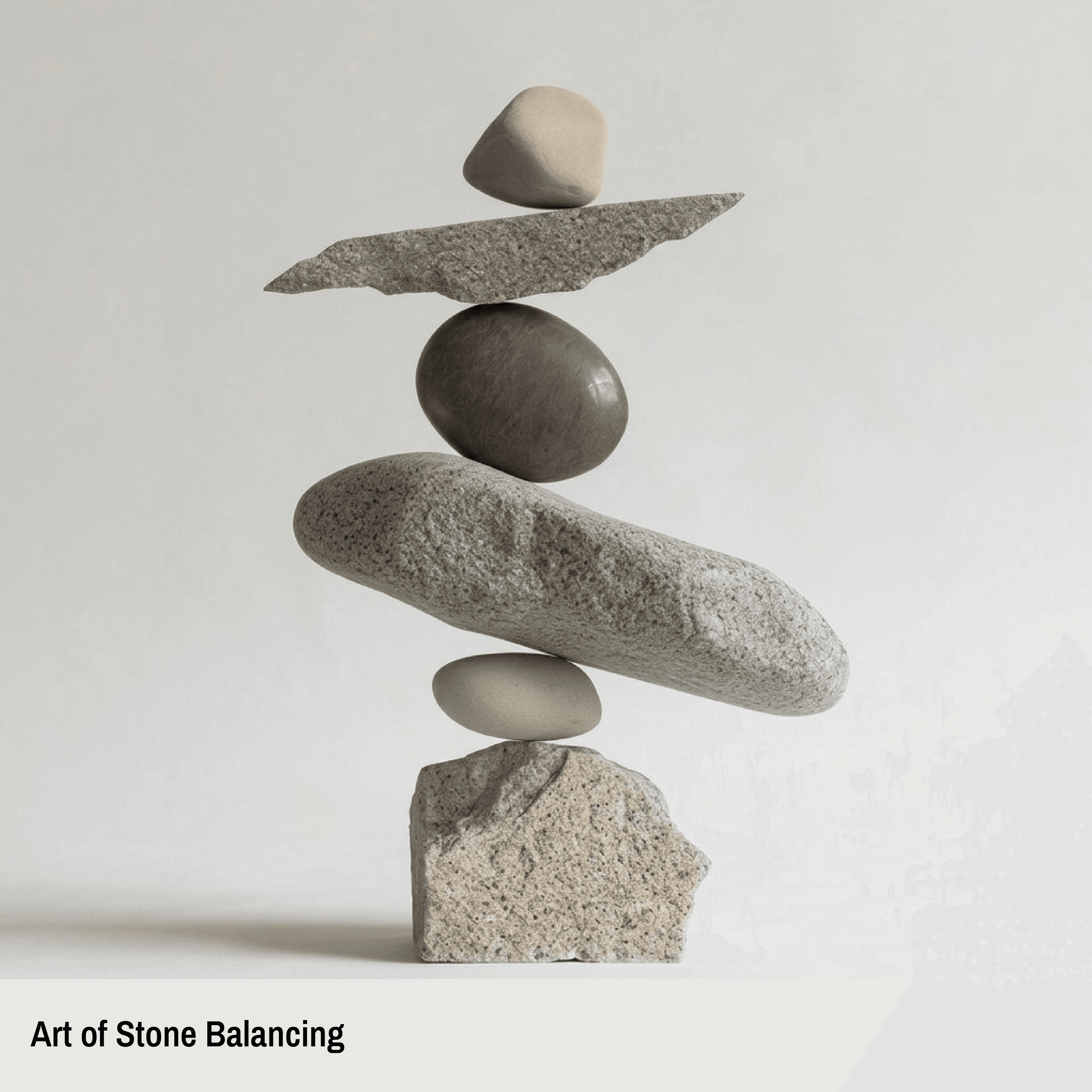
Inspired by the practice of balancing stones, we observed how each element supports the other to create a sense of stability and calm. This idea of rhythmic balance became central to both the brand identity and its philosophy. Therefore, the typography centric logo is arranged in a stacked composition, subtly echoing the vertical layering of the stones. The varying font weights add a sense of grounding with “foundation” acting as the literal base of the structure. The minimal design reflects the brand’s approach to mindfulness, making wellness feel approachable and intuitive without feeling overwhelming or overly instructional.
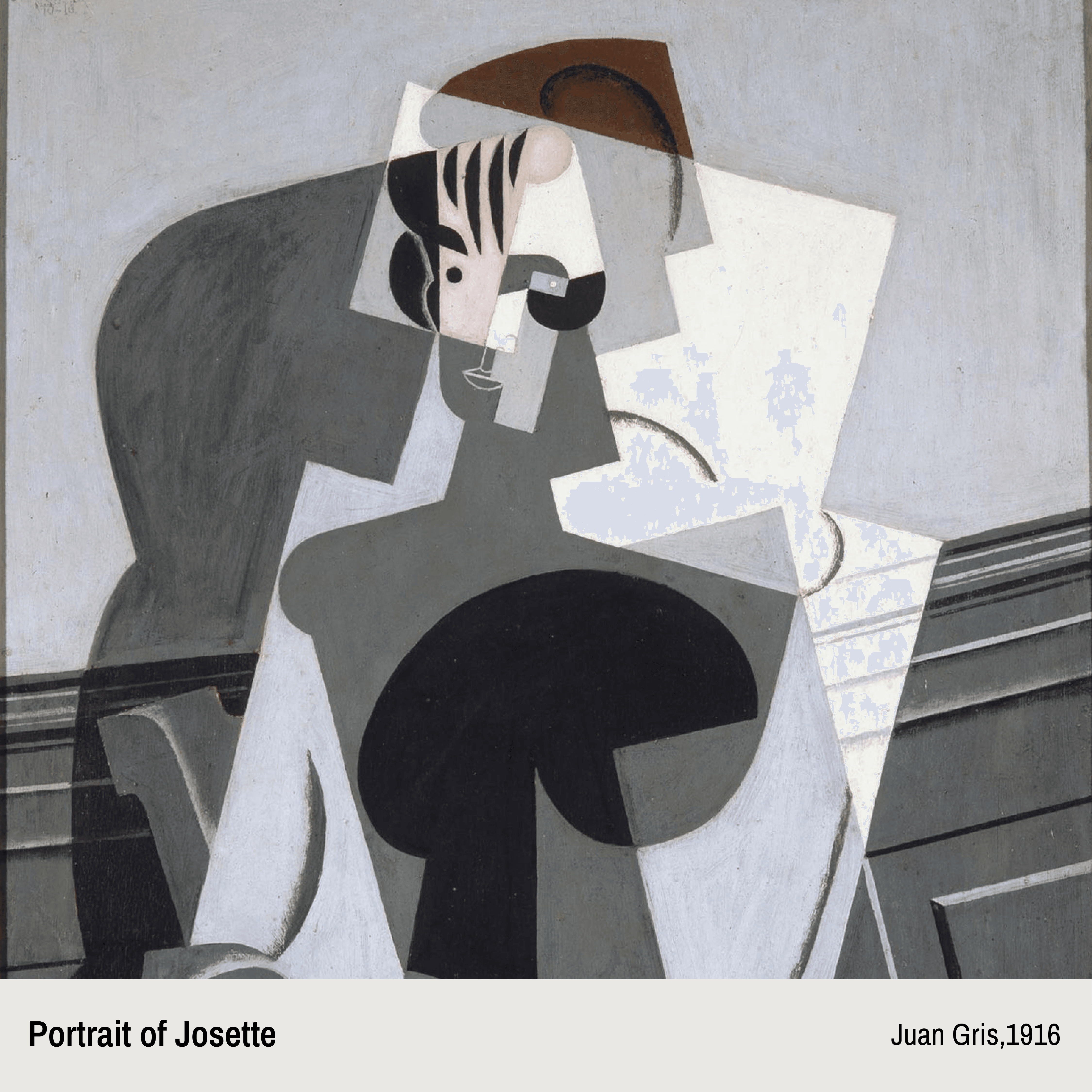
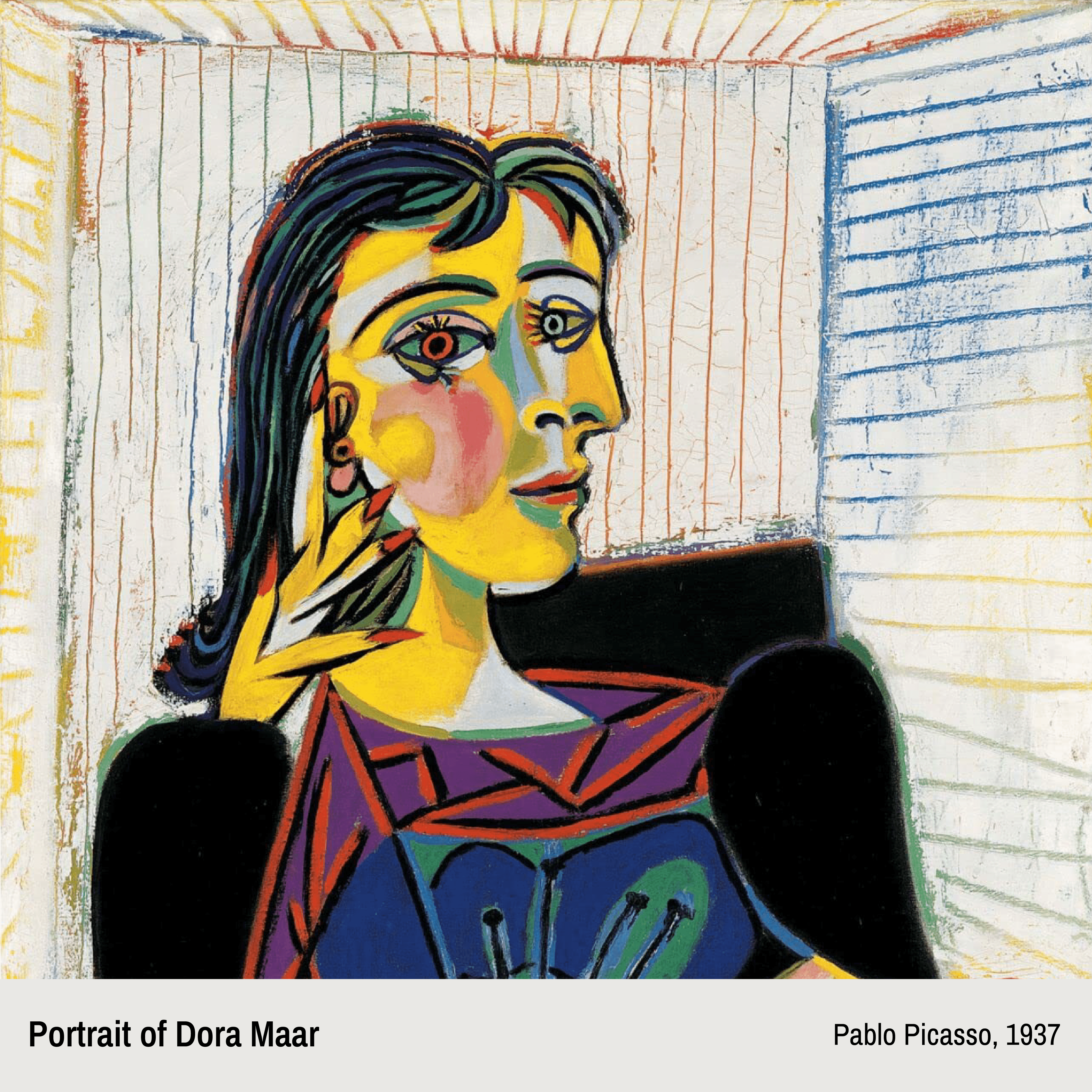
Artist Inspiration Behind the Mascots
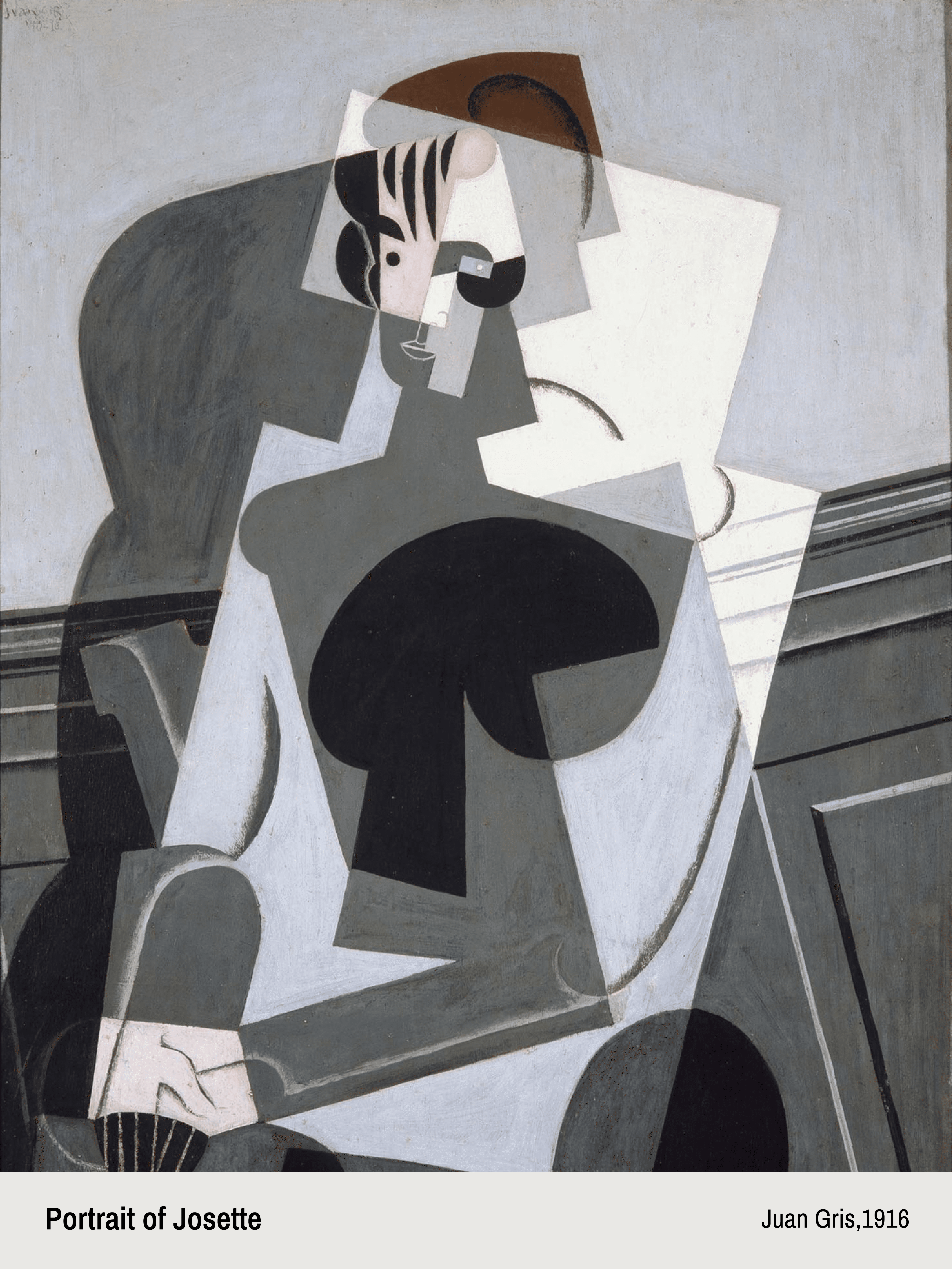
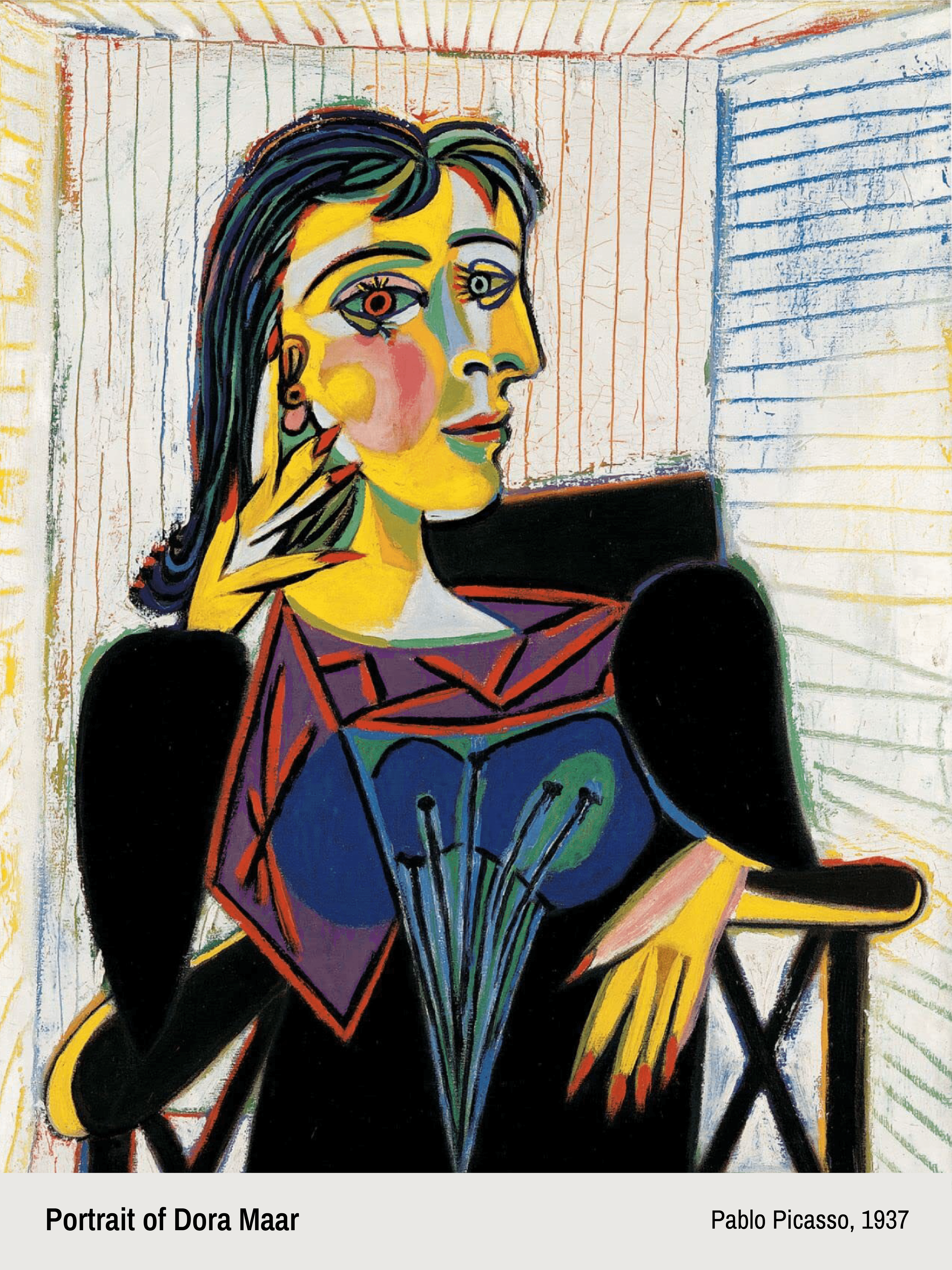
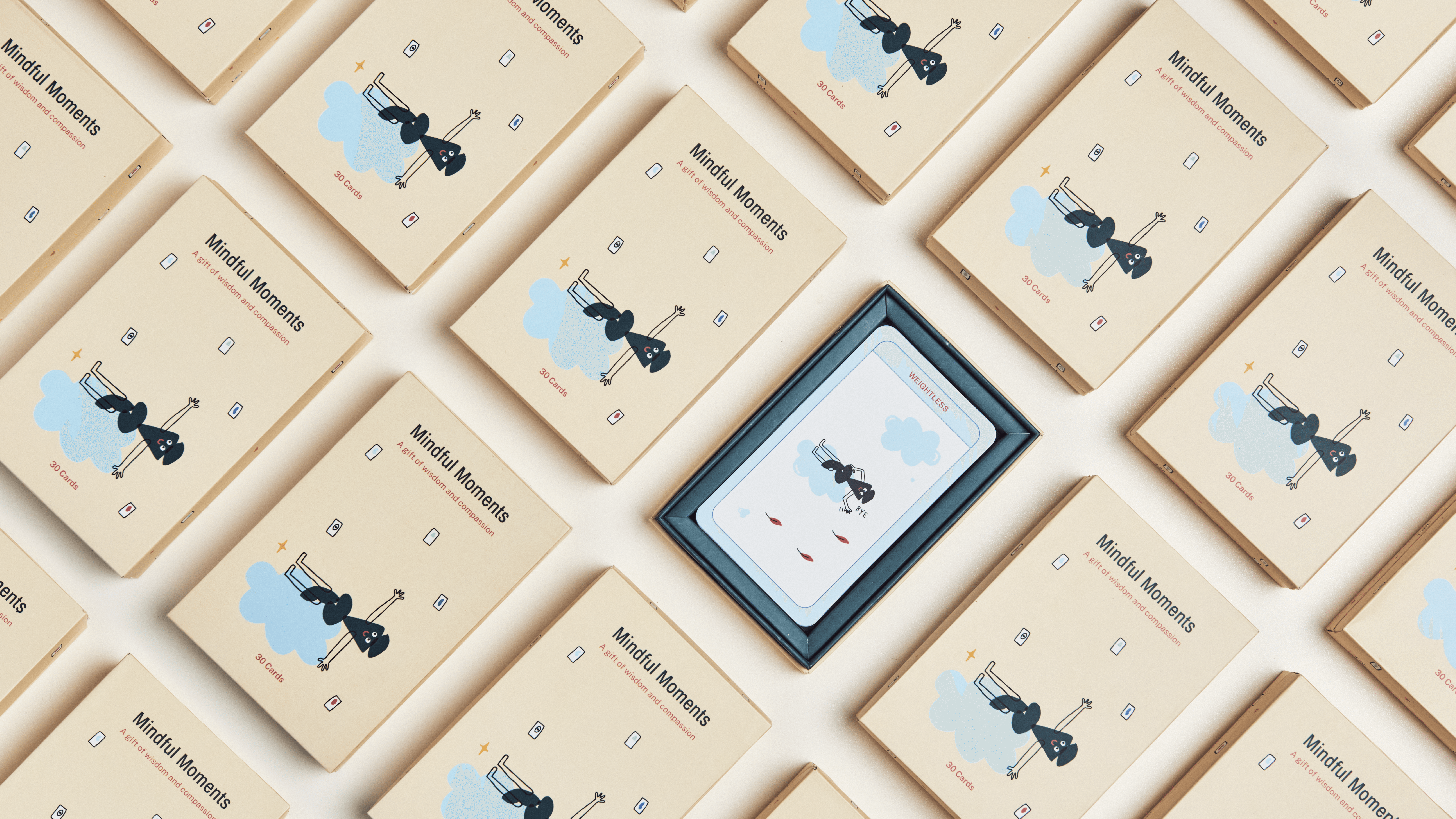
Drawing from Cubism’s fragmented perspectives and synesthesia’s cross-sensory connections, the brand identity explores well-being as a combination of overlapping emotions, sensations and experiences. Extending the stone balancing motif, we created a human-like mascot with movement, a sense of life and a playful personality.It reflects the idea that wellness is an ongoing process of finding stability and making adjustments to maintain your mental wellbeing.
Colour of Emotions
The colour palette playfully balances the warmth and calm often associated with mindfulness. Earthy greens and muted neutrals form the backbone, inspired by natural elements such as stones, forests, sand and organic textures. These tones bring a sense of grounding, balance and stillness to the identity.
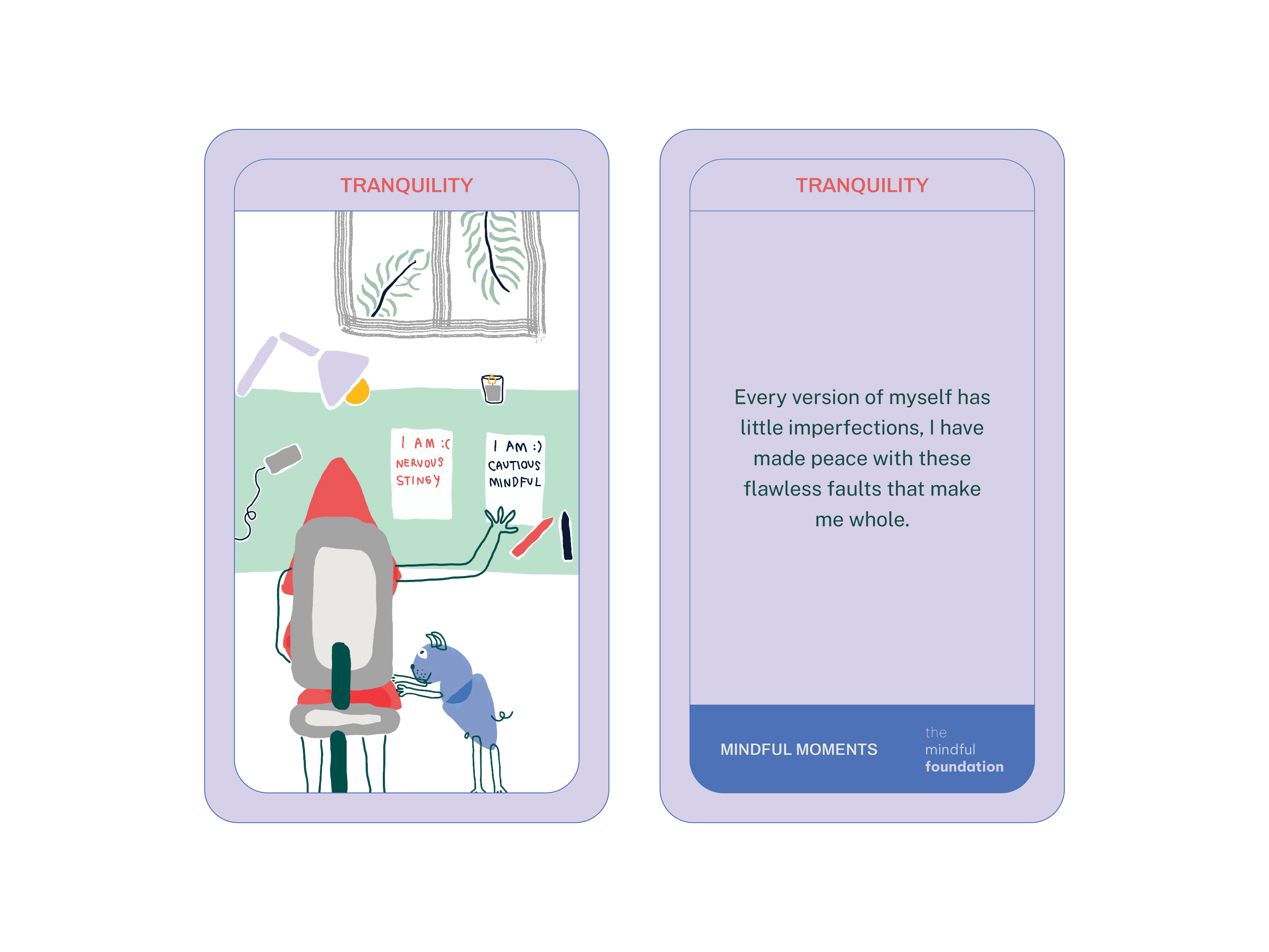
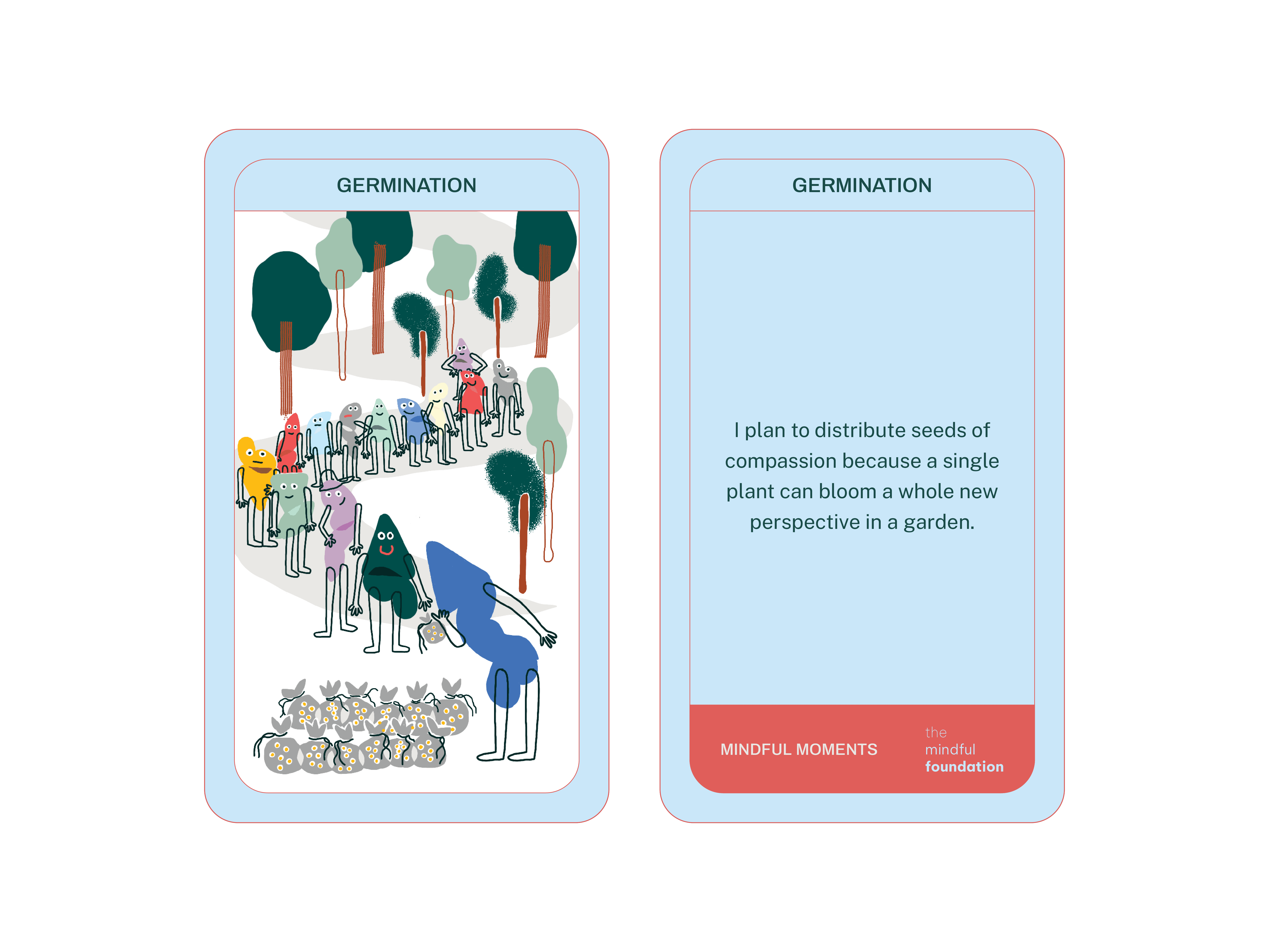
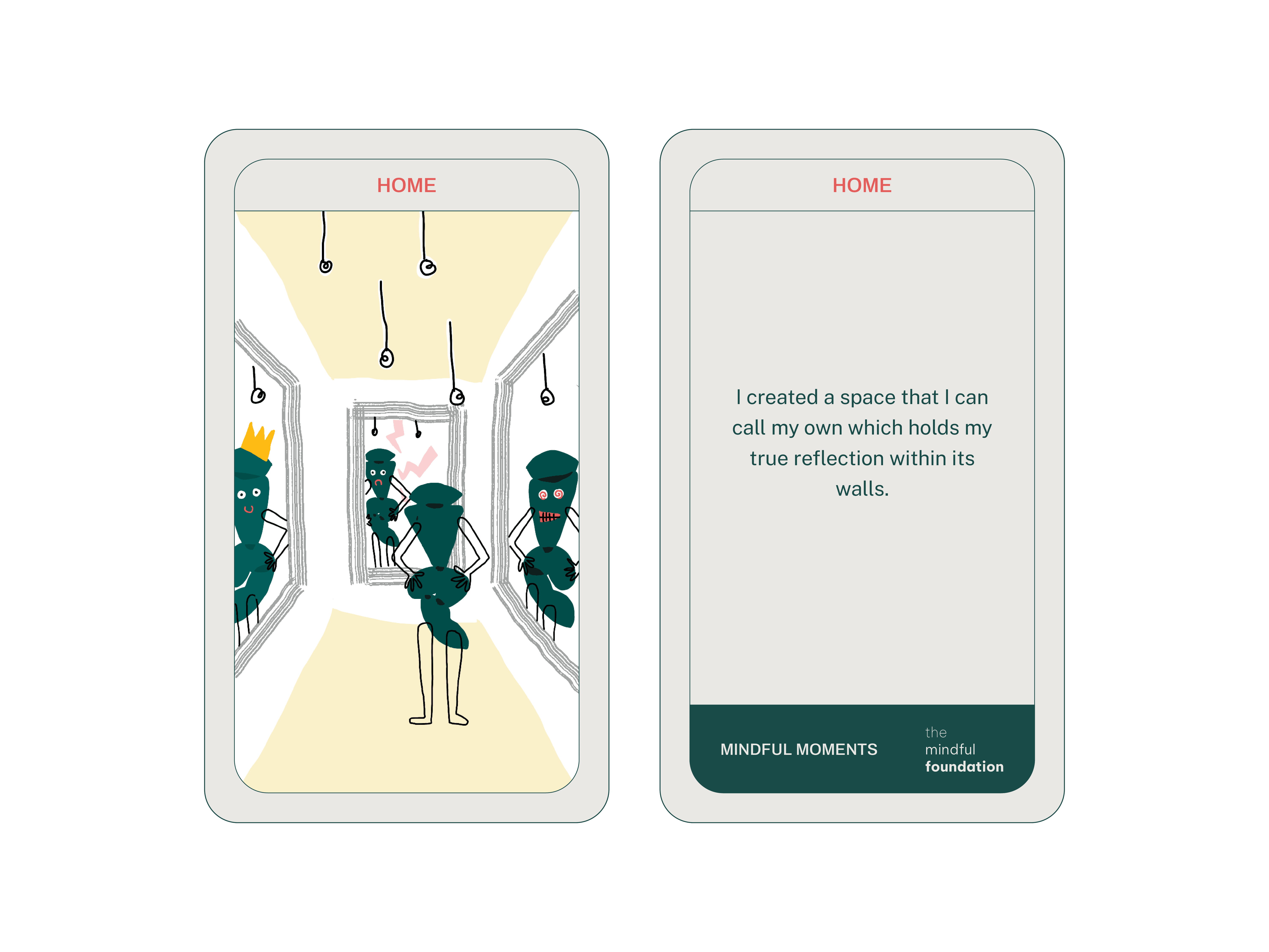
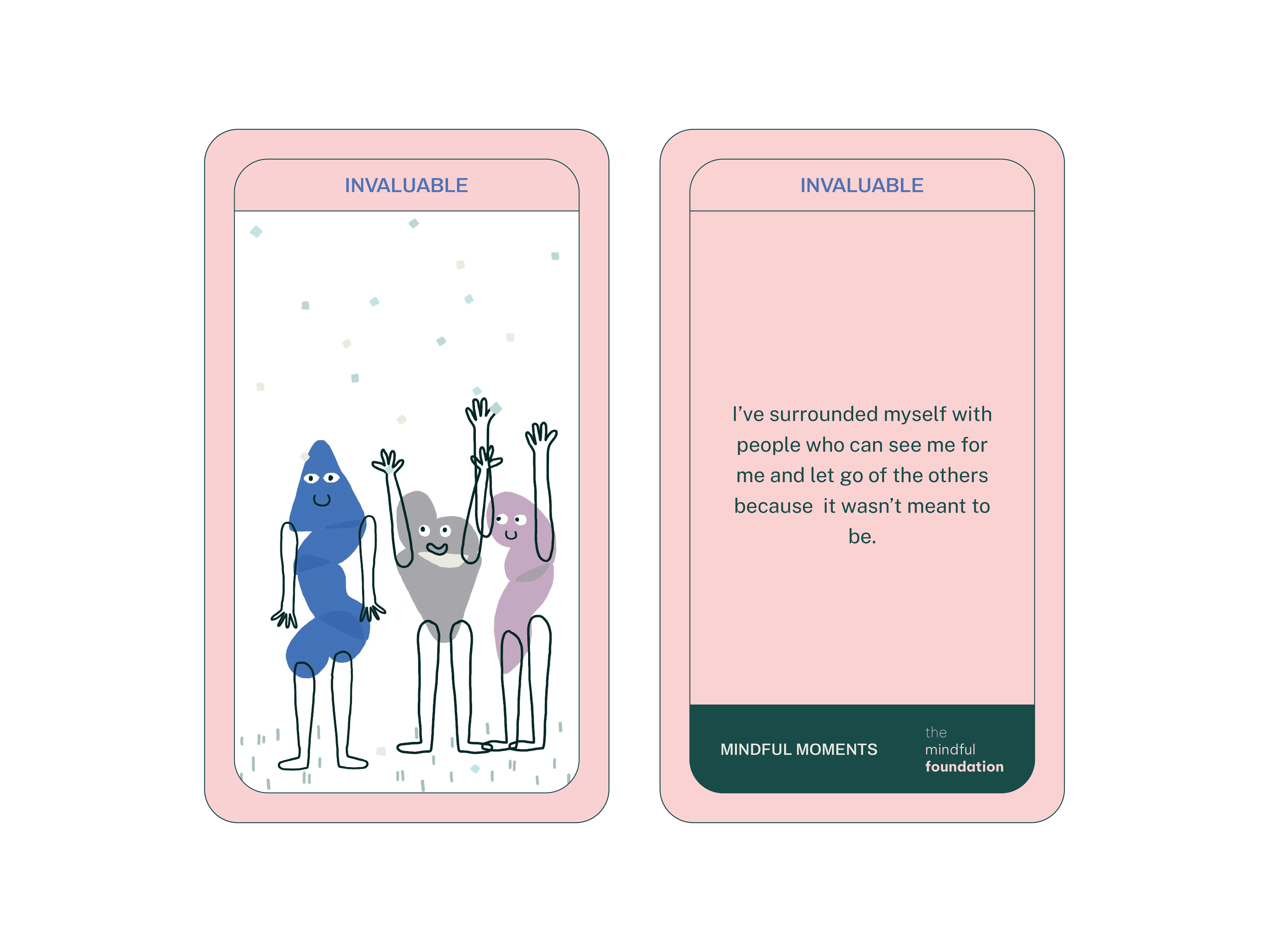
Illustrating Mindful Moments
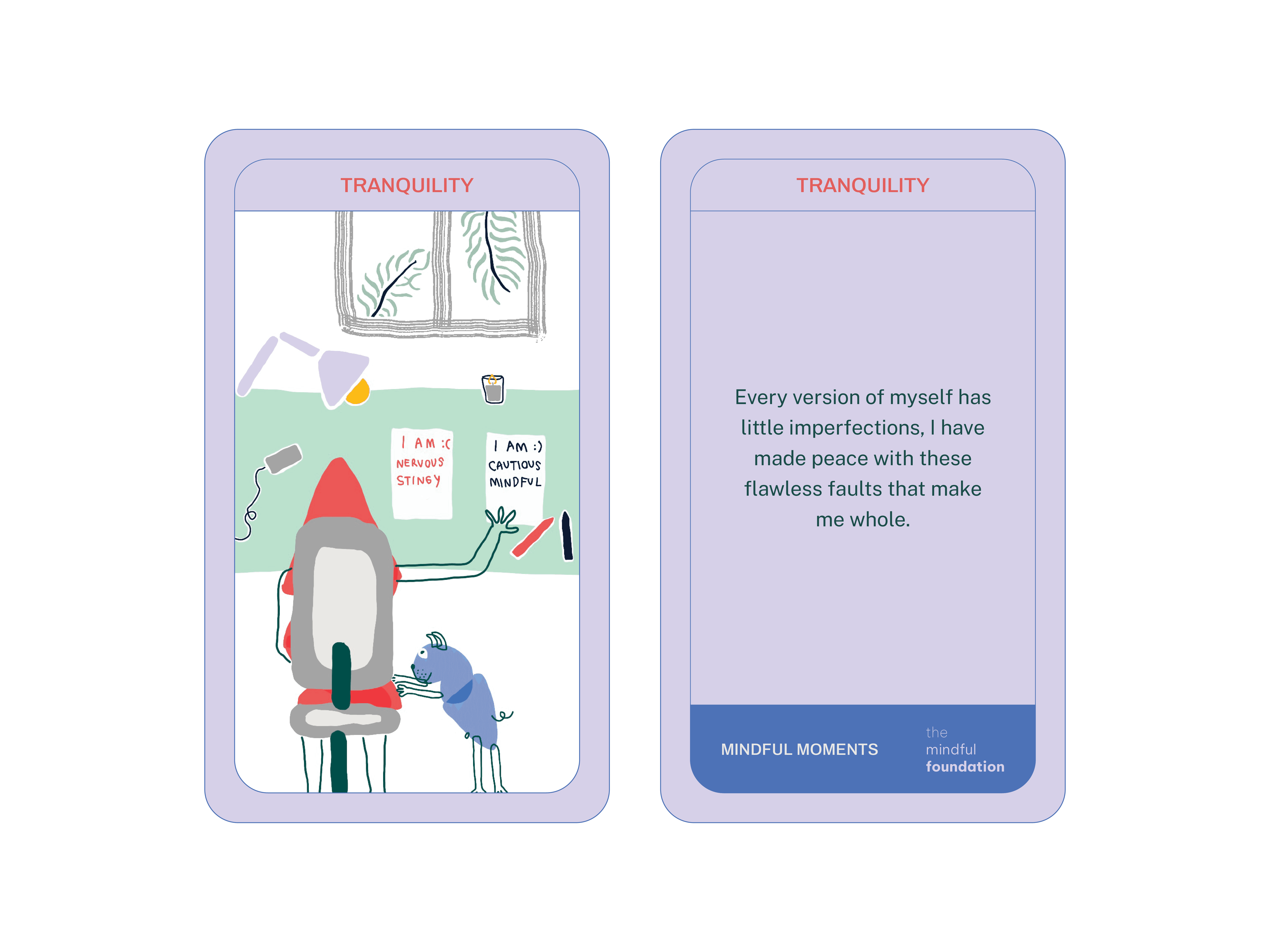
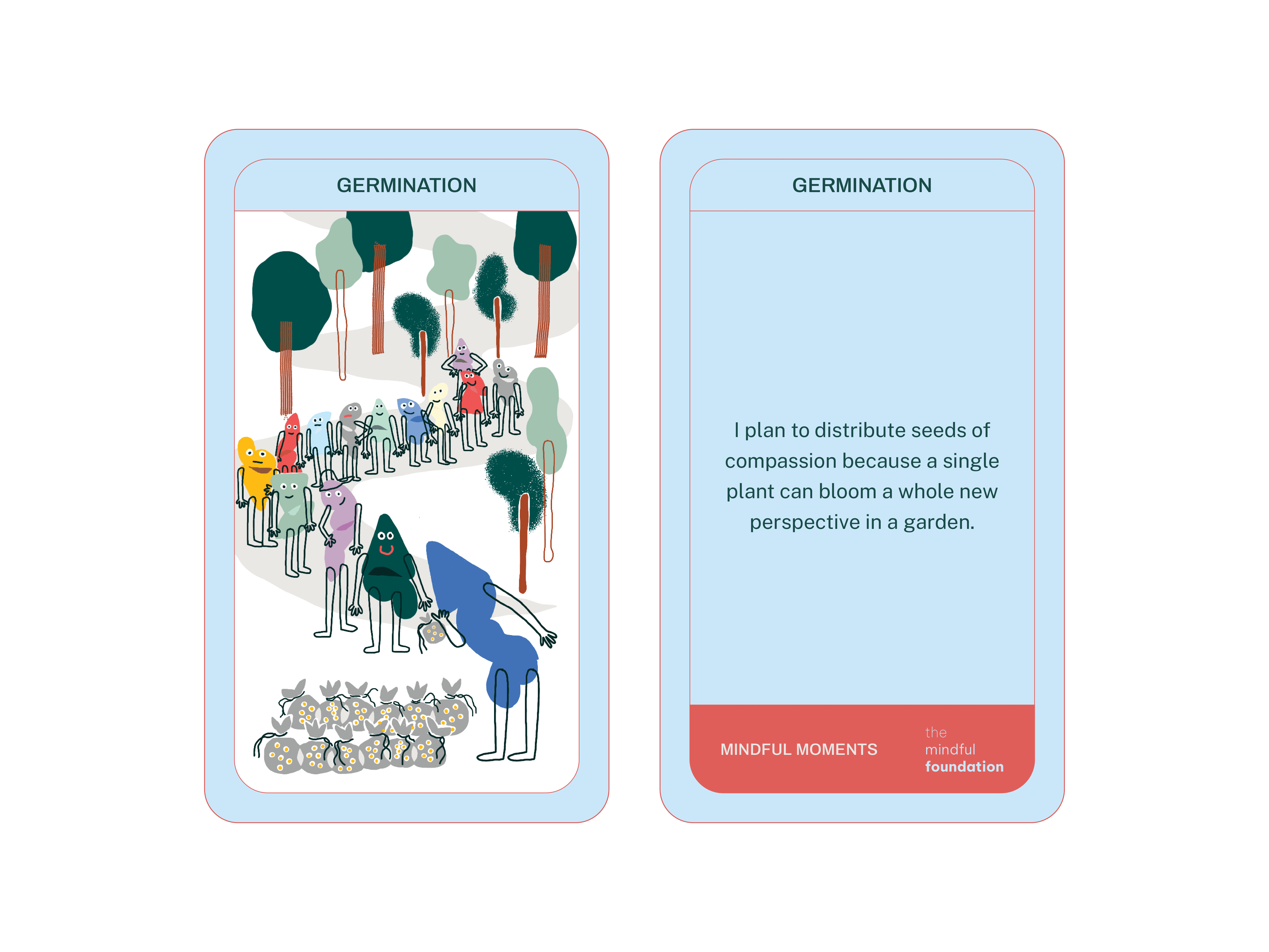
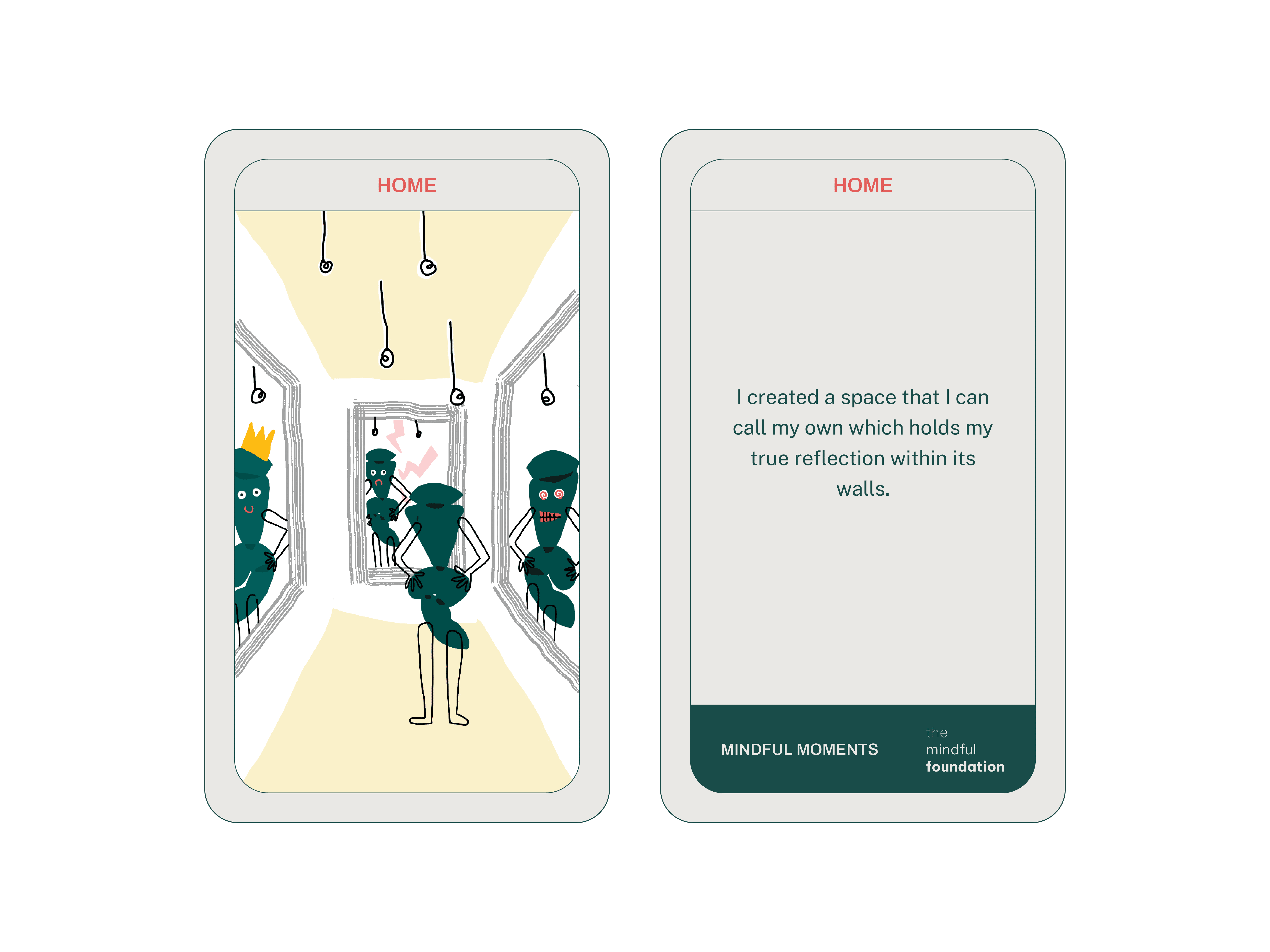
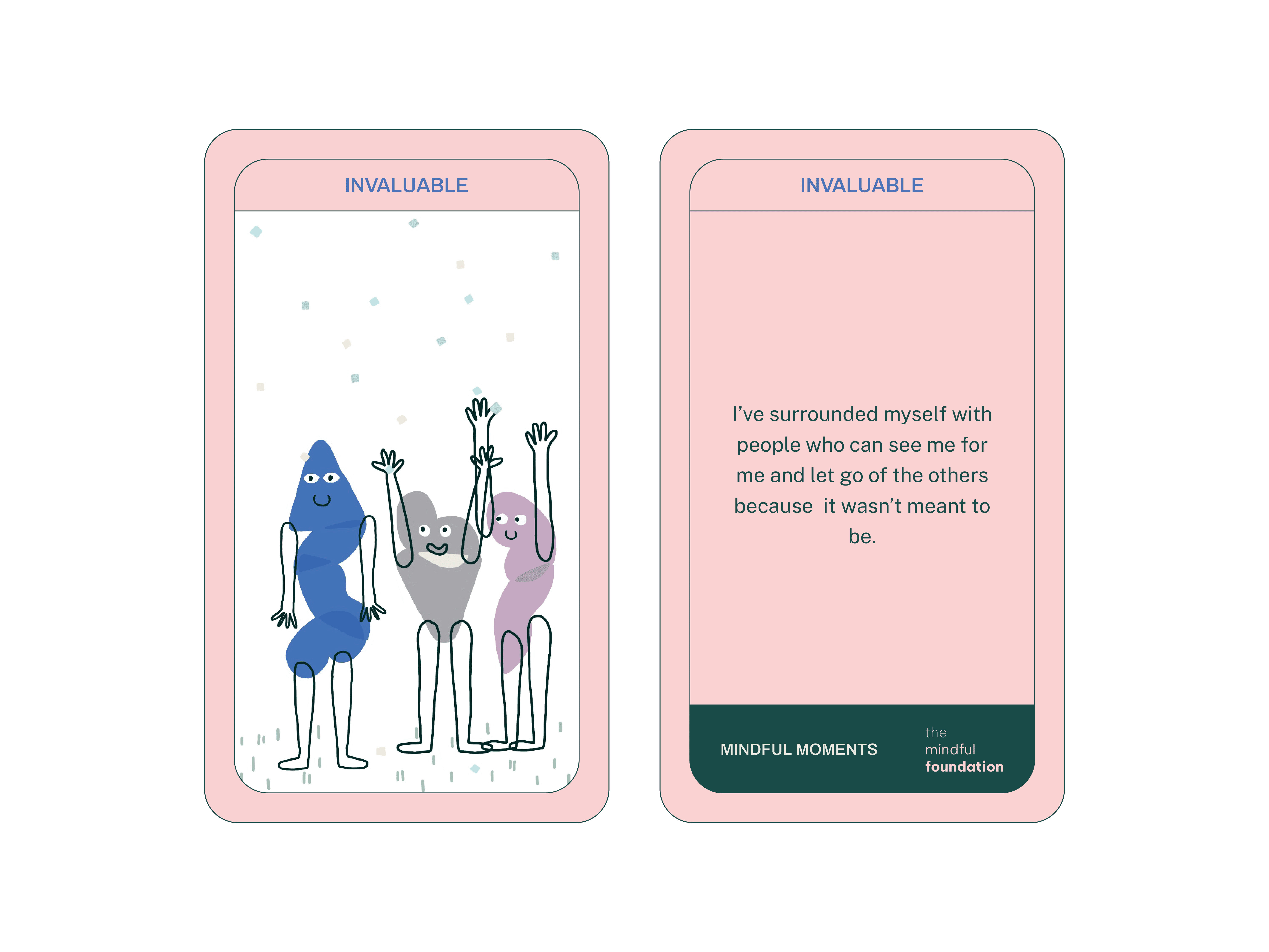
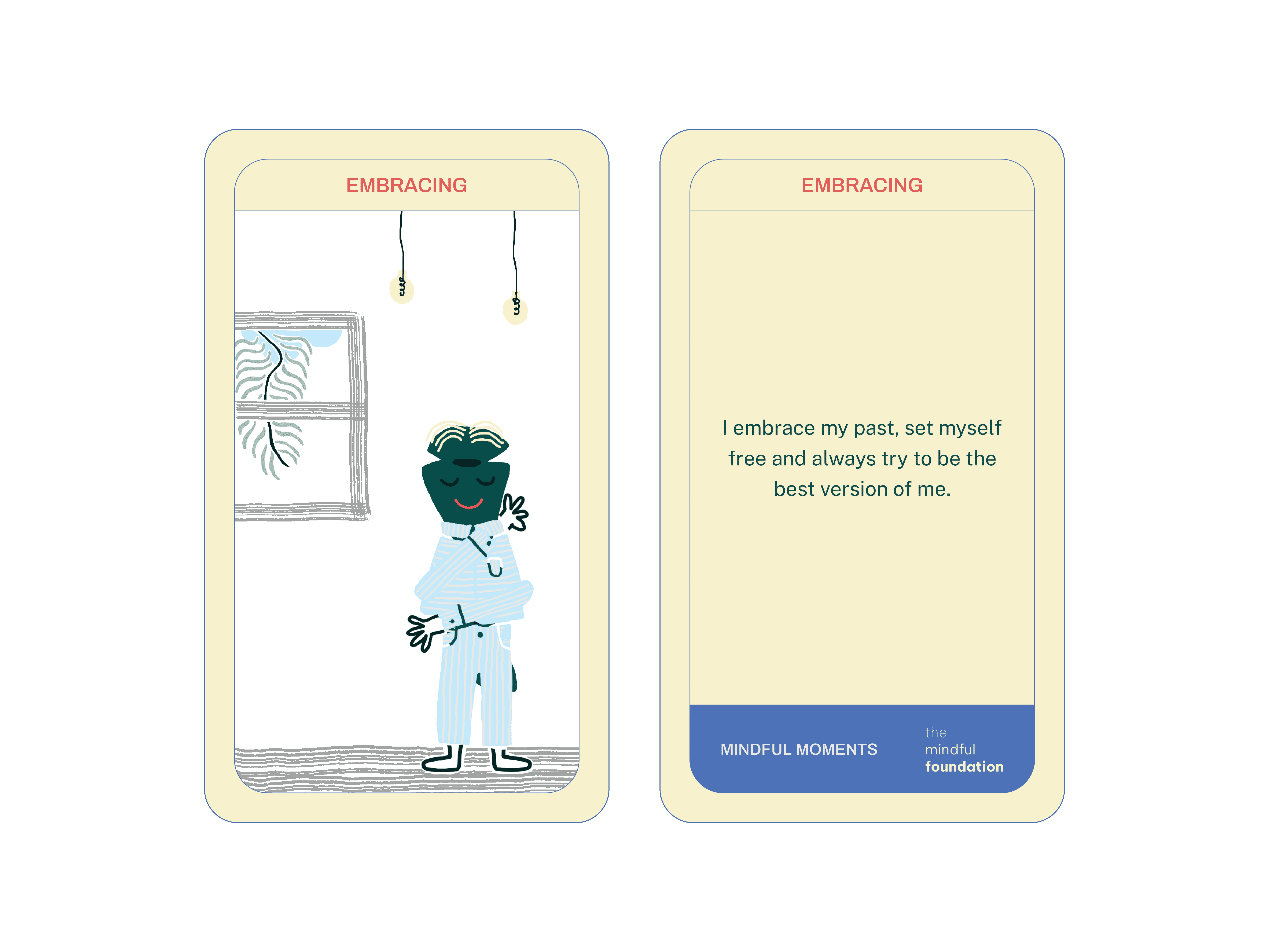
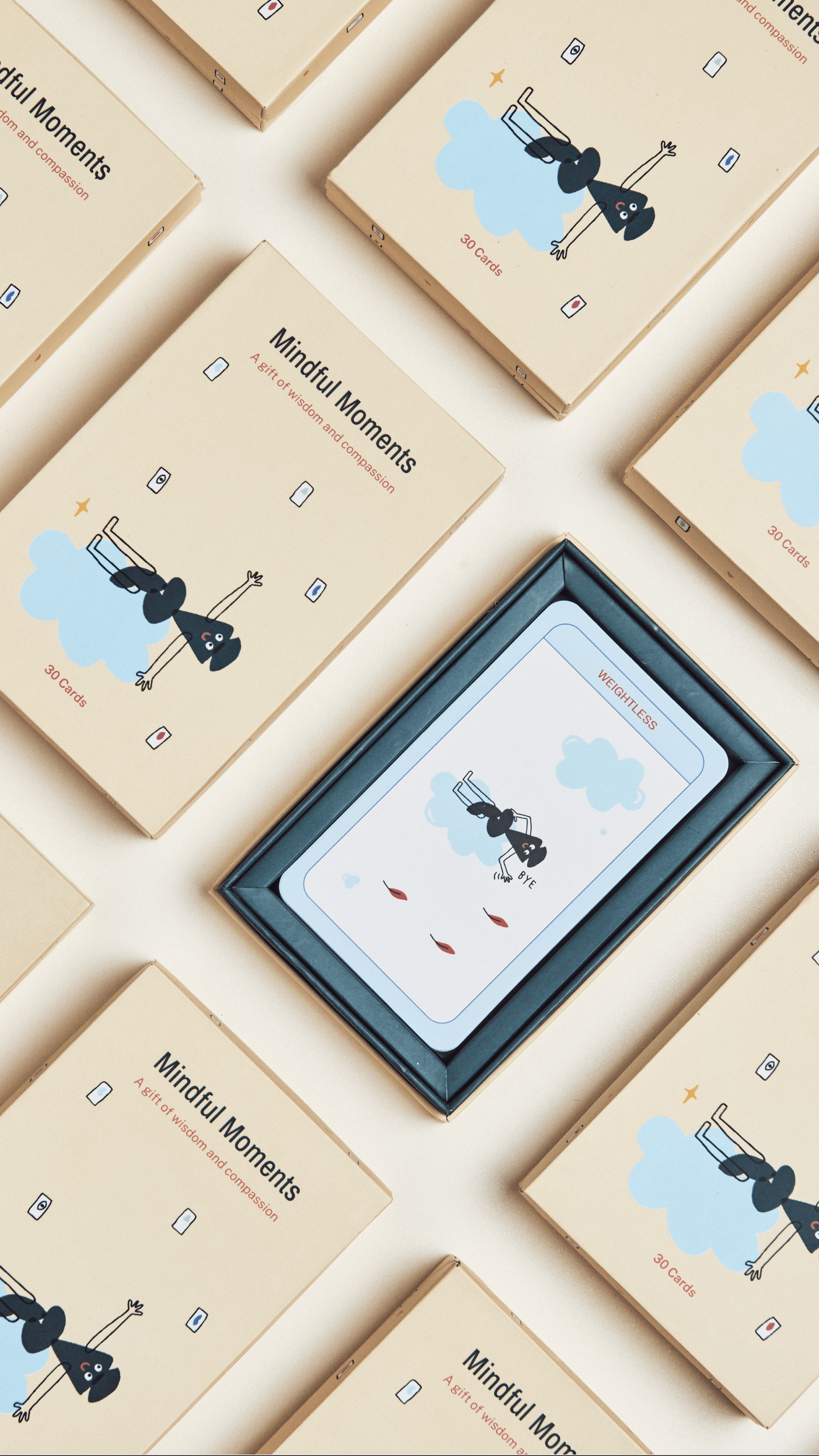
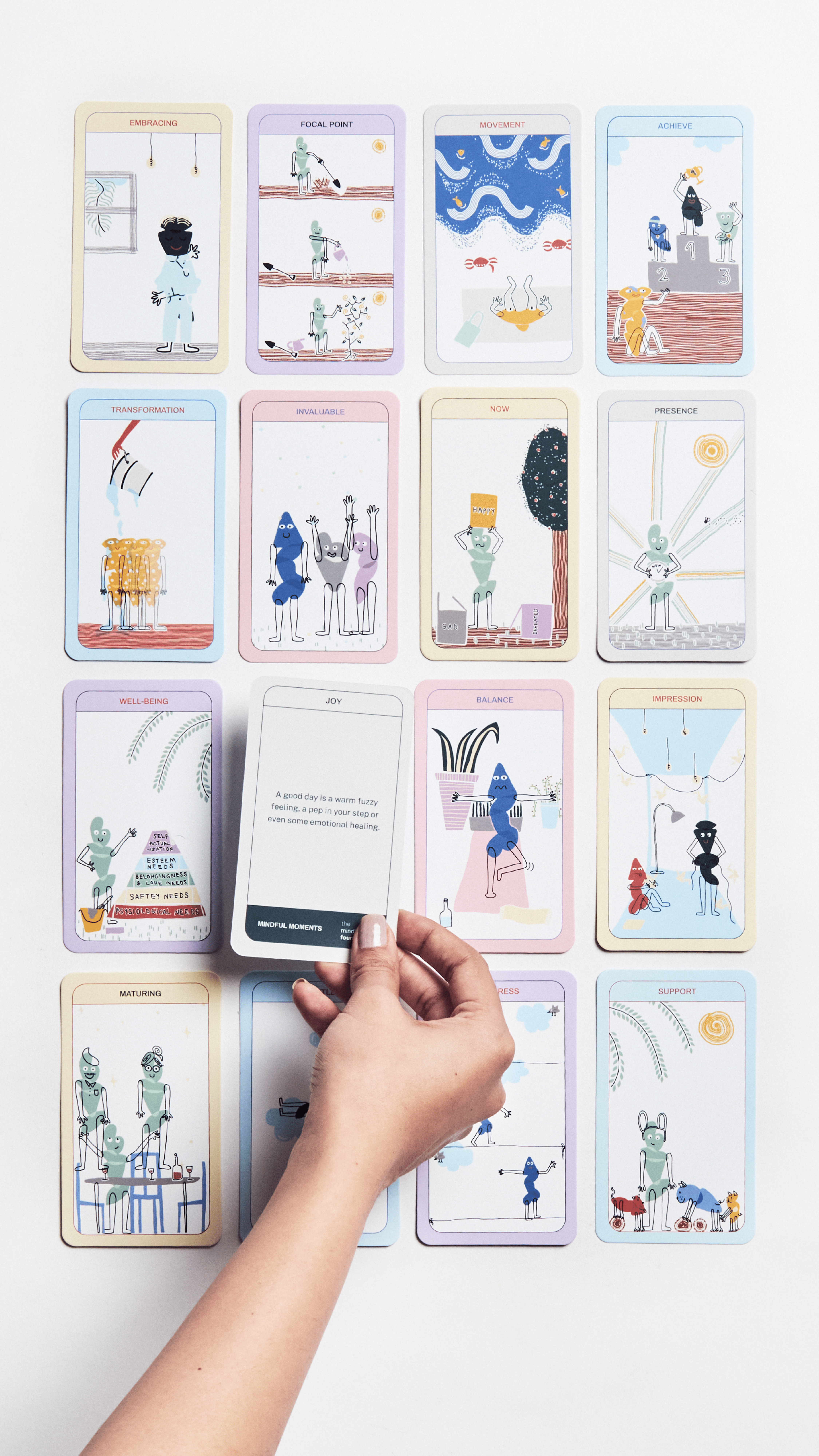
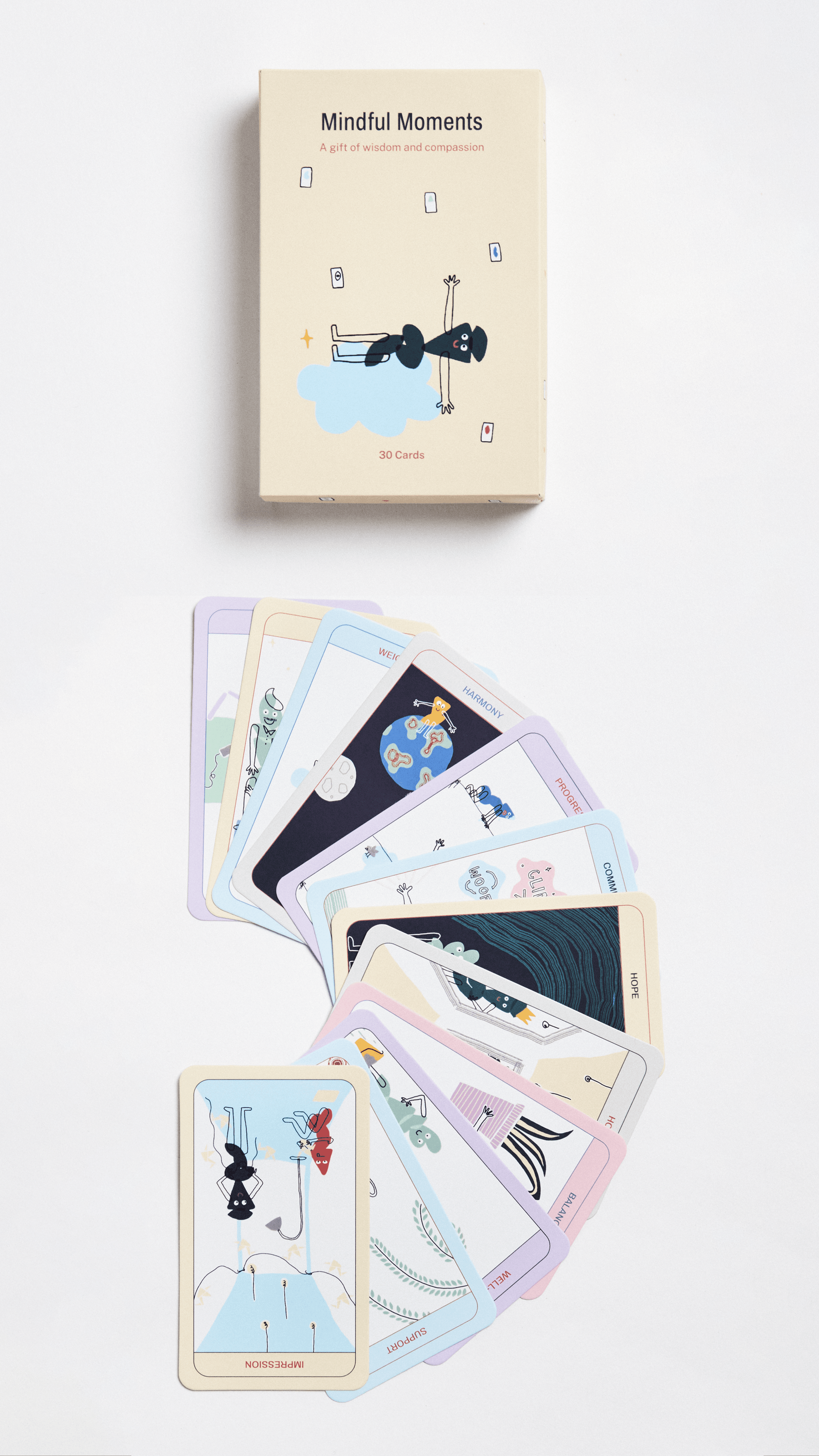
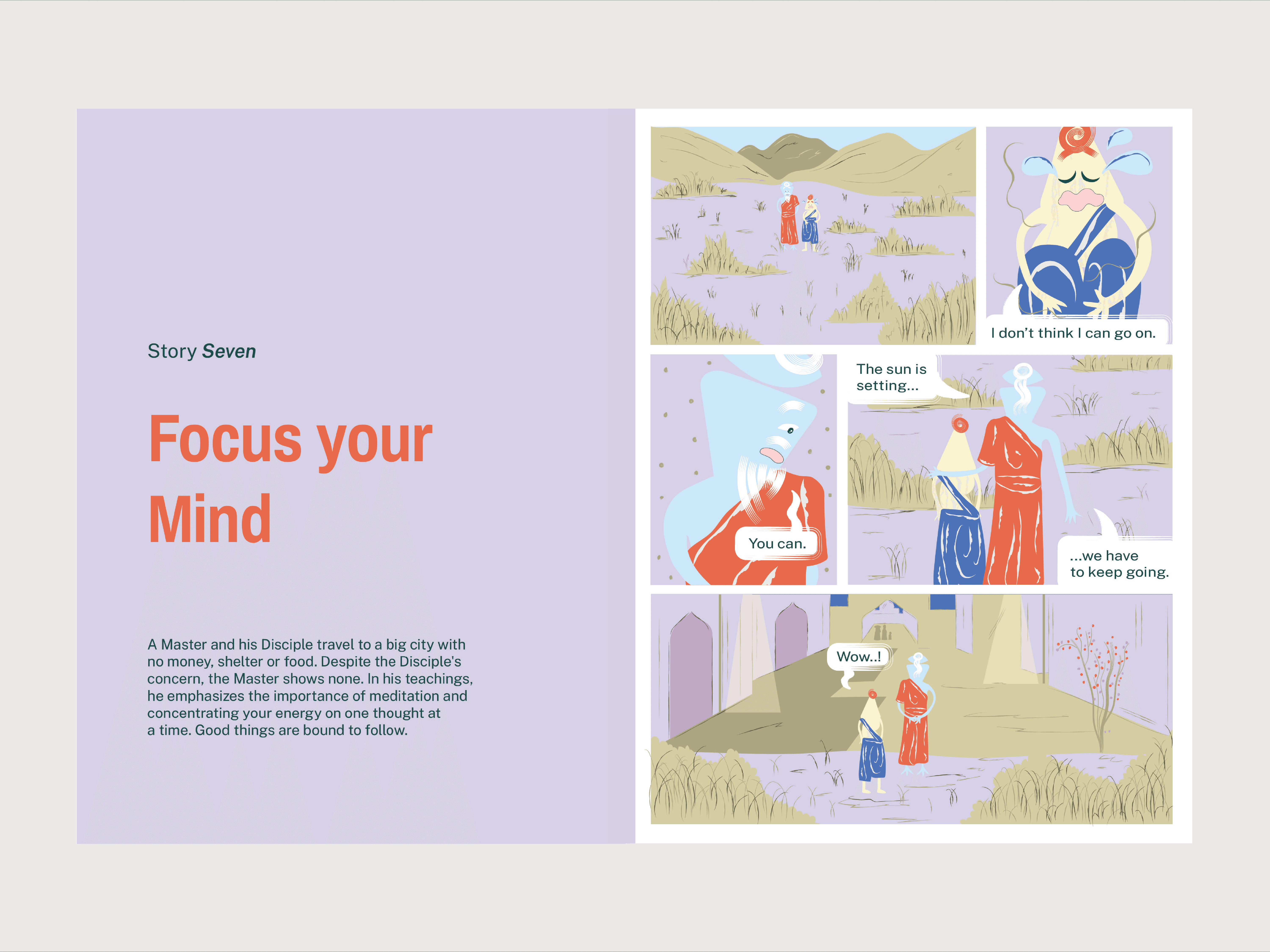
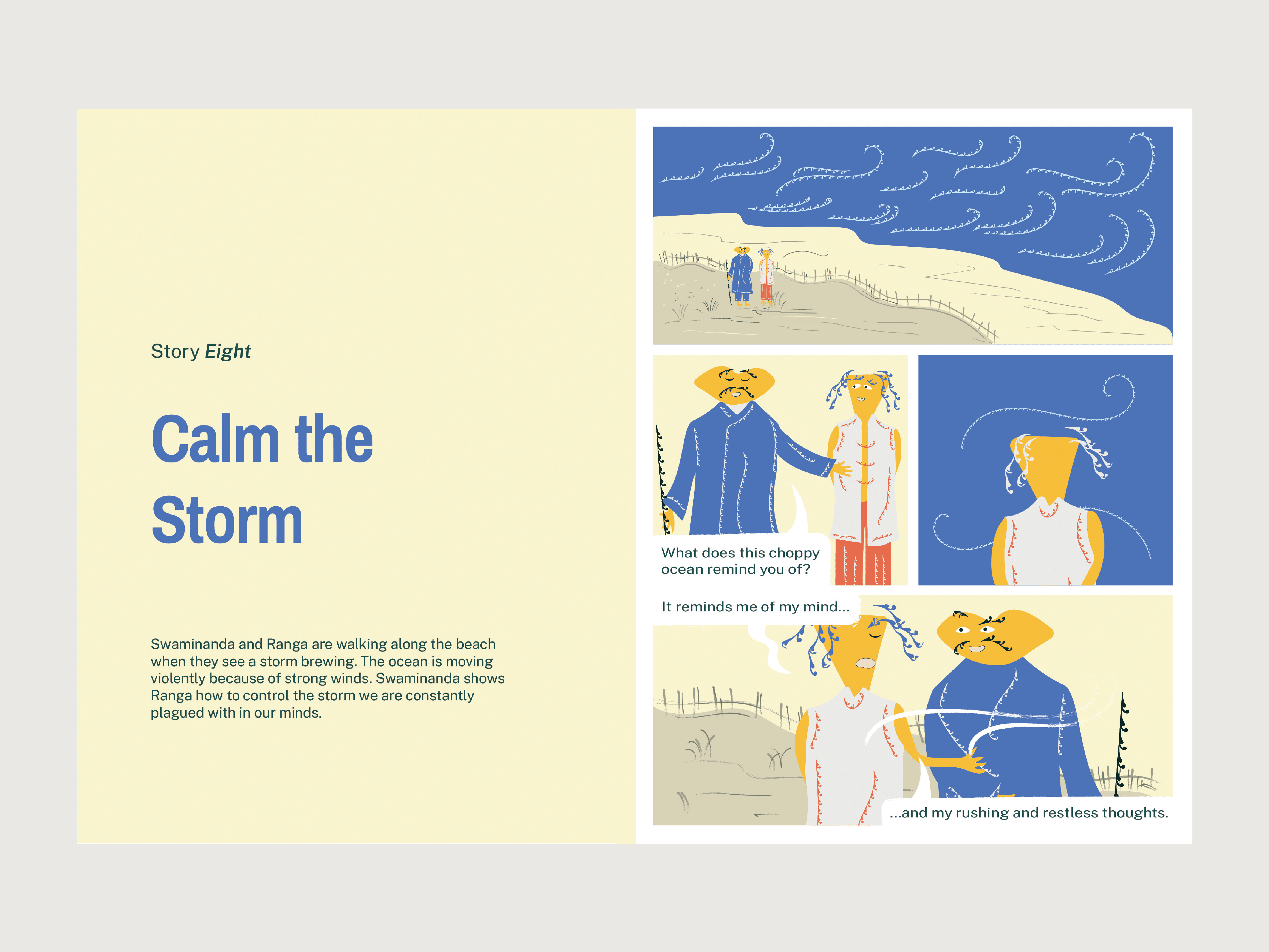
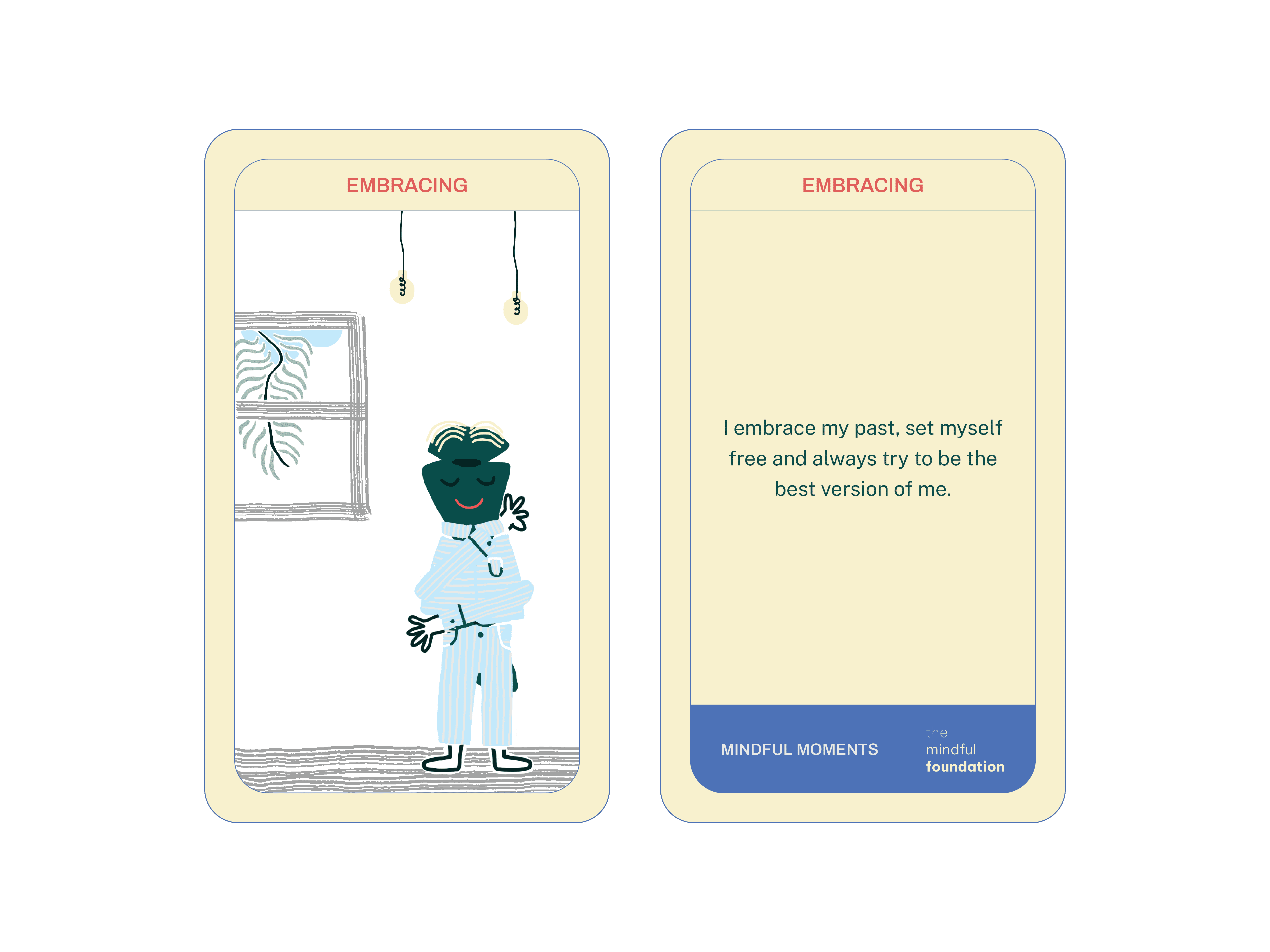
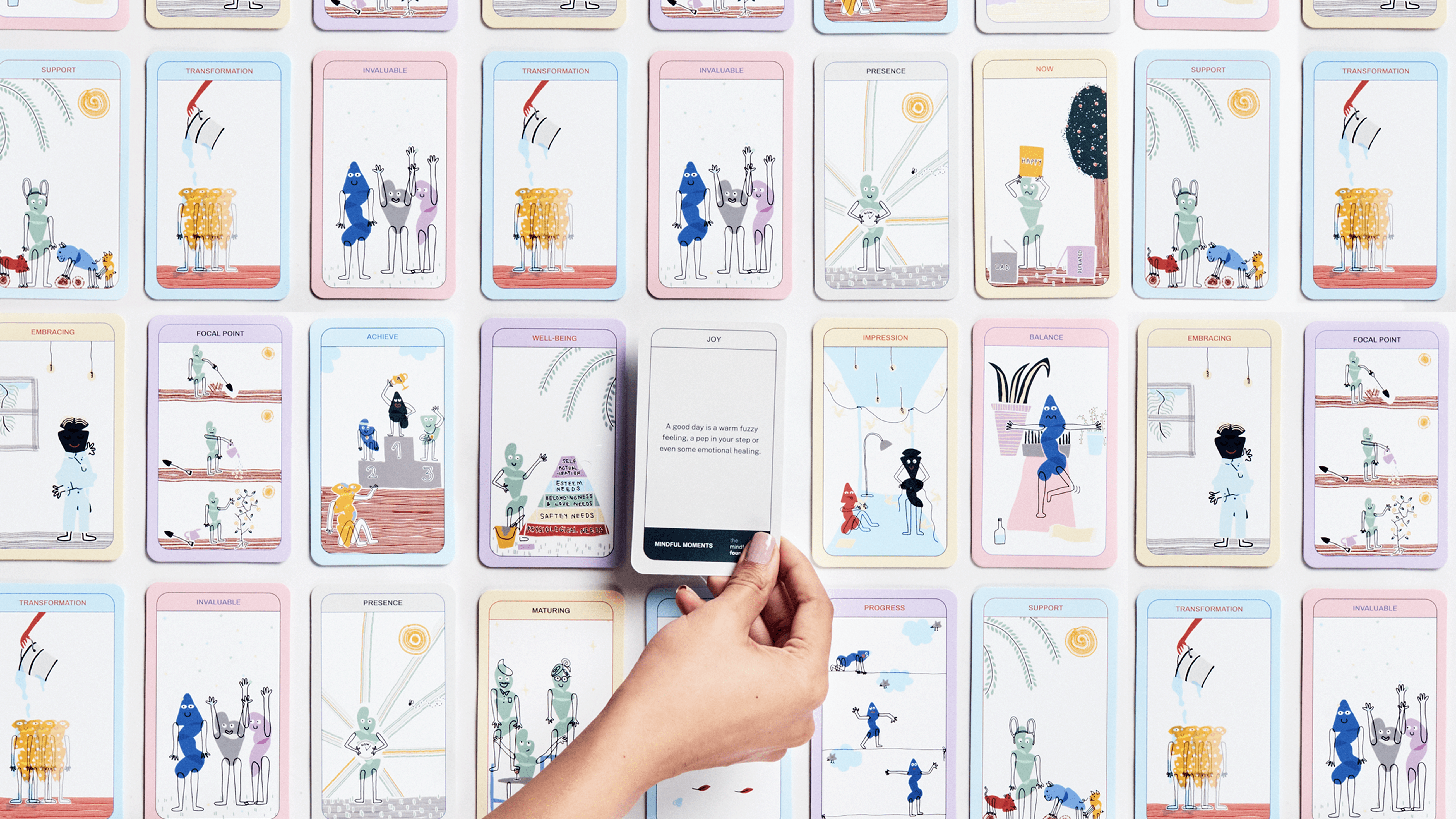
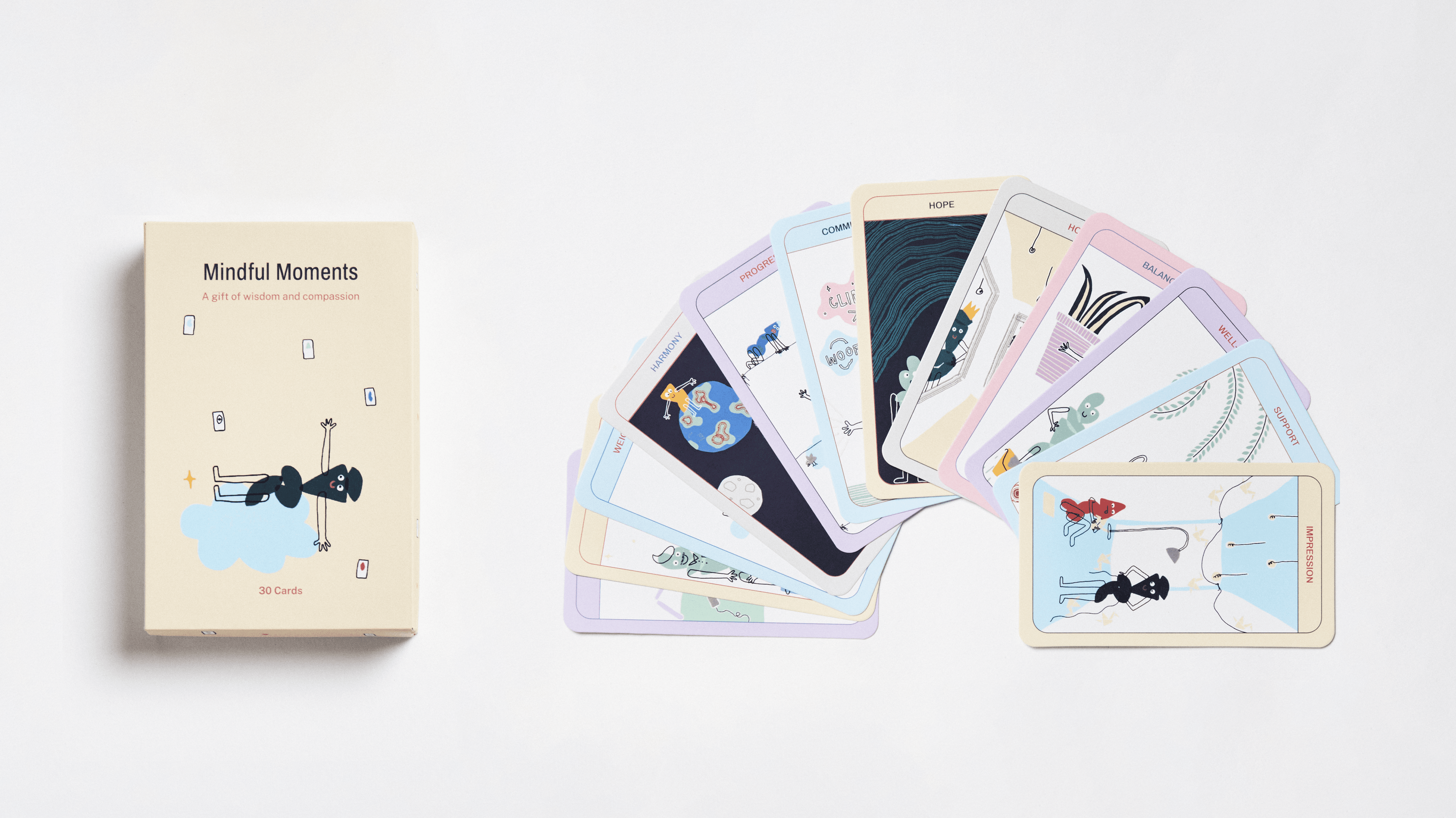
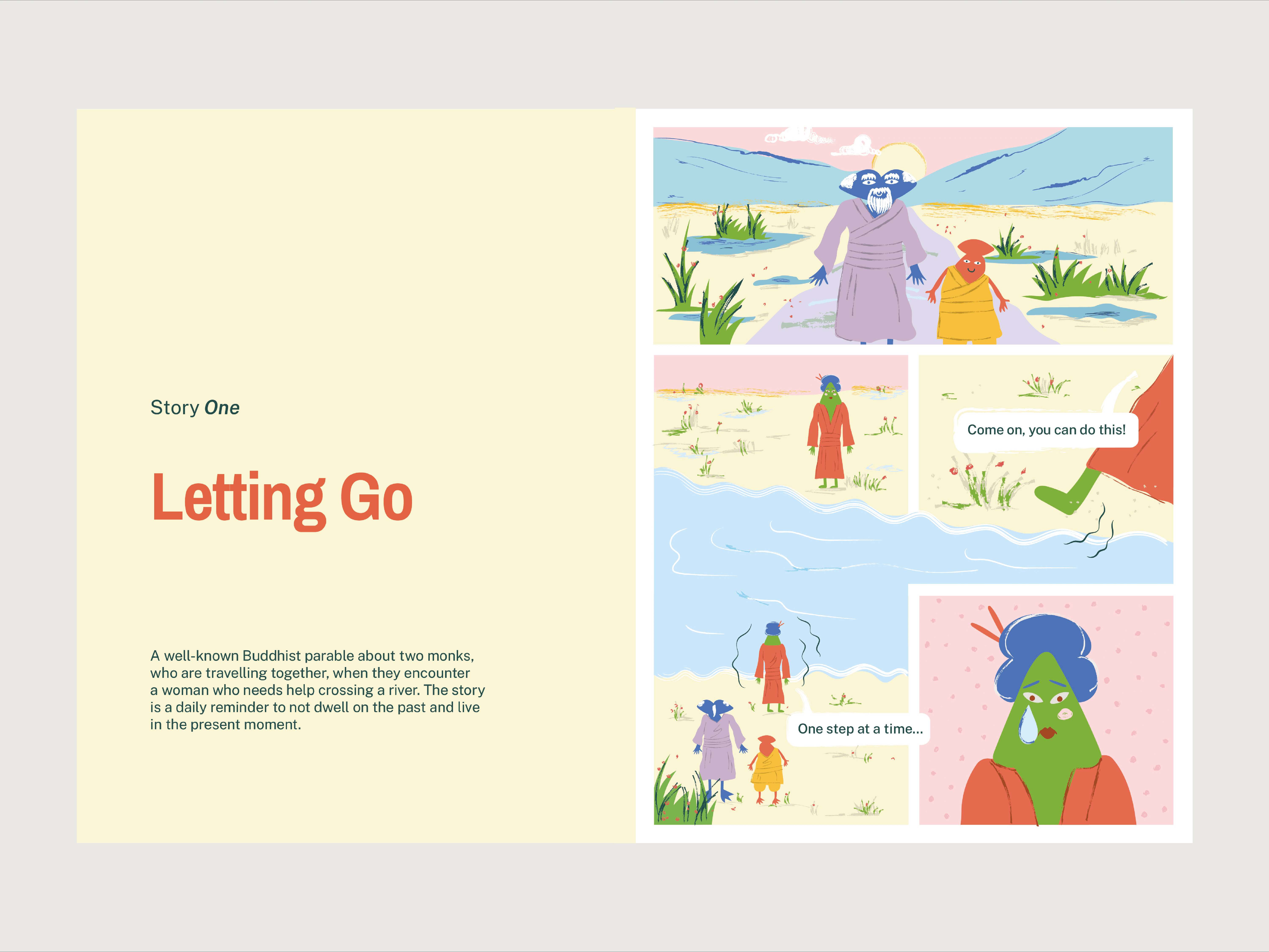
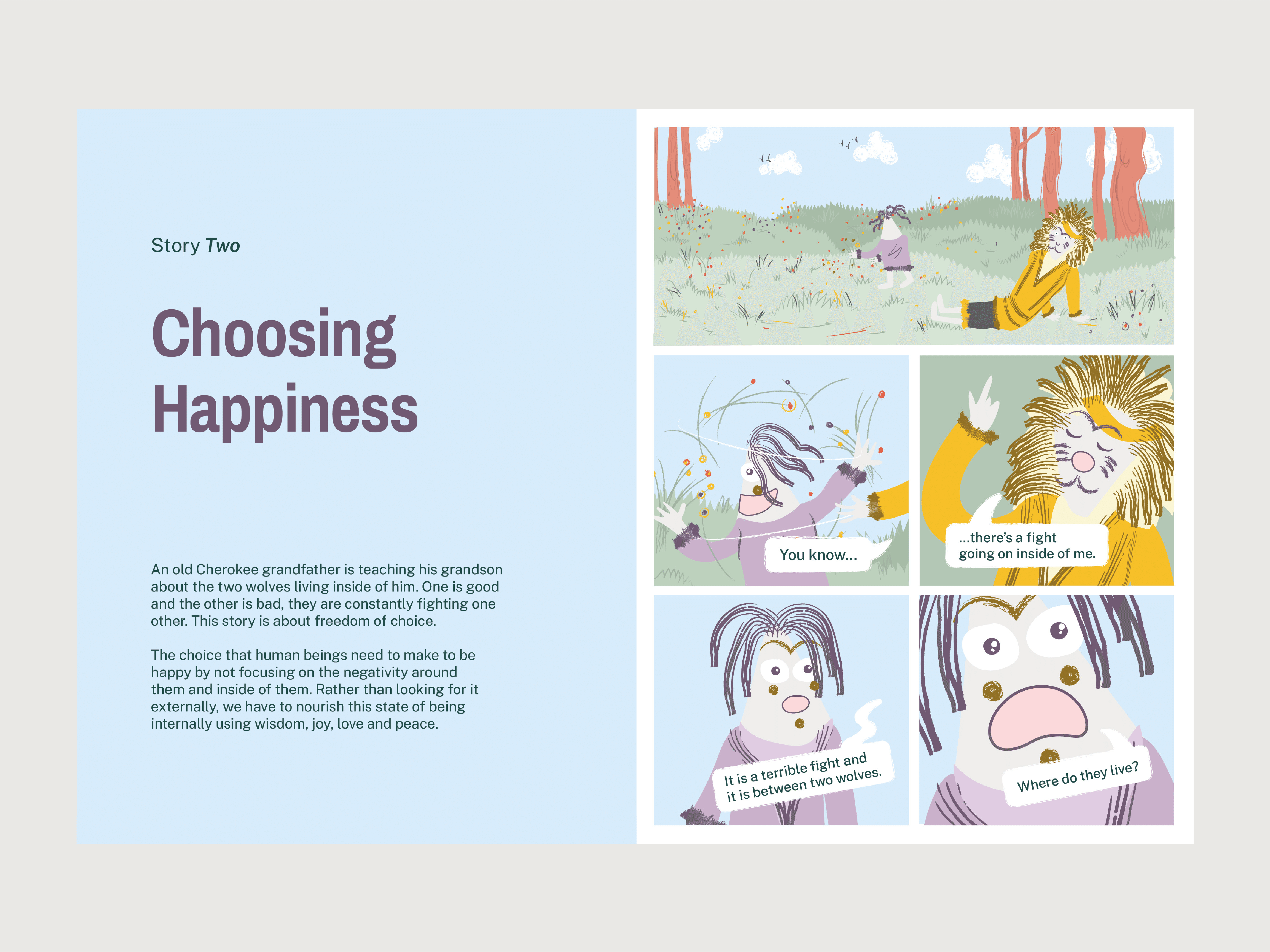
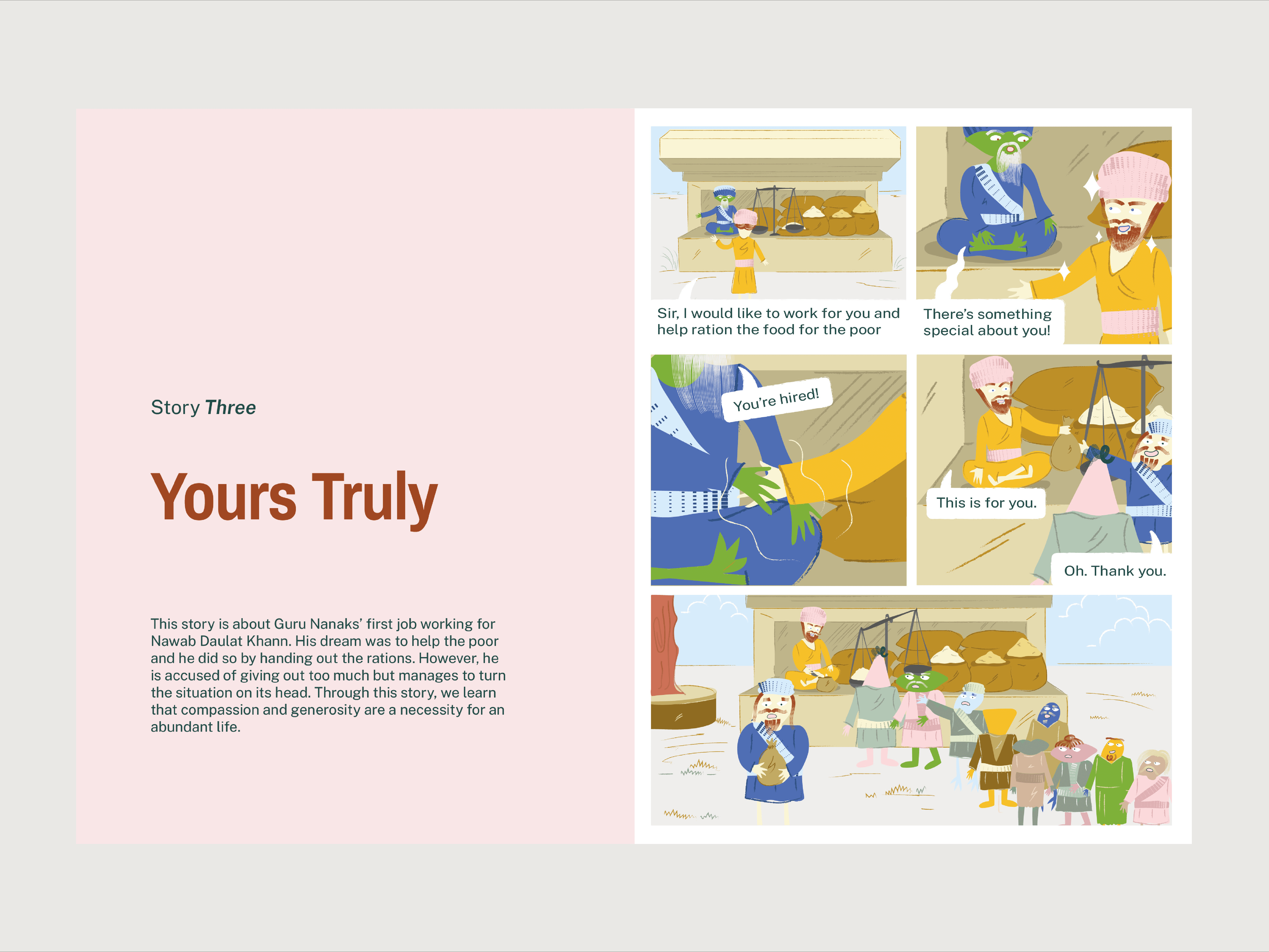
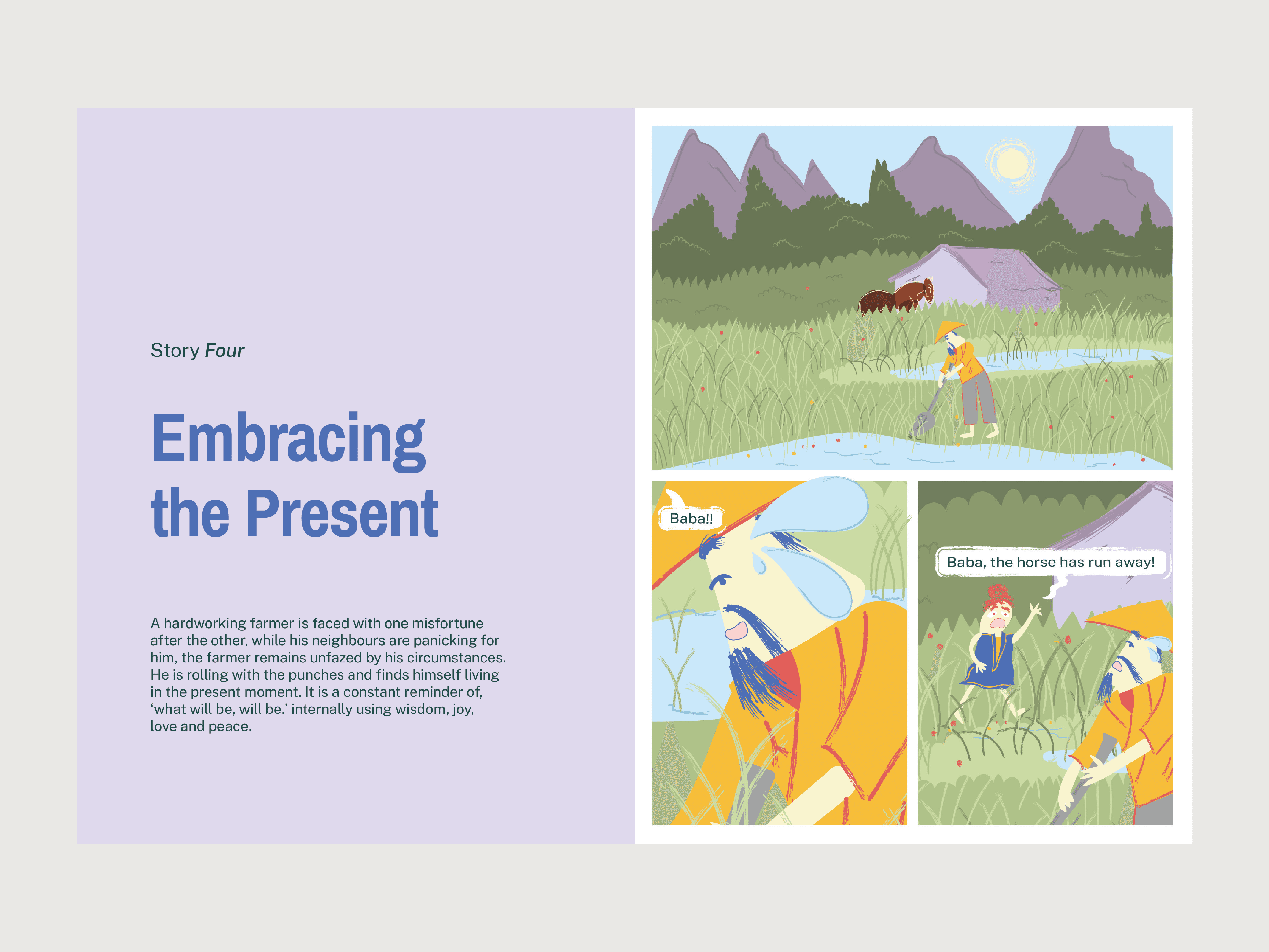
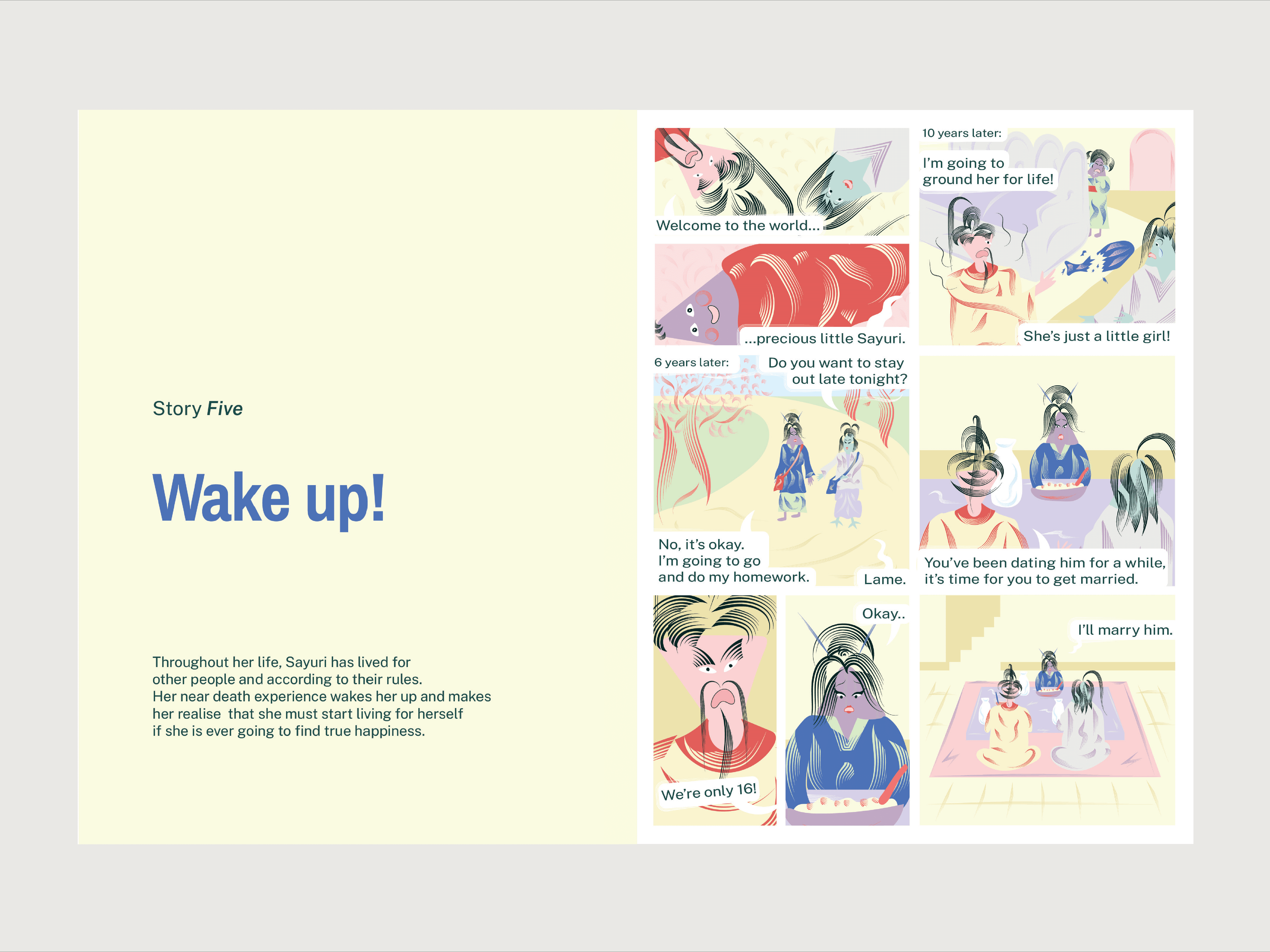
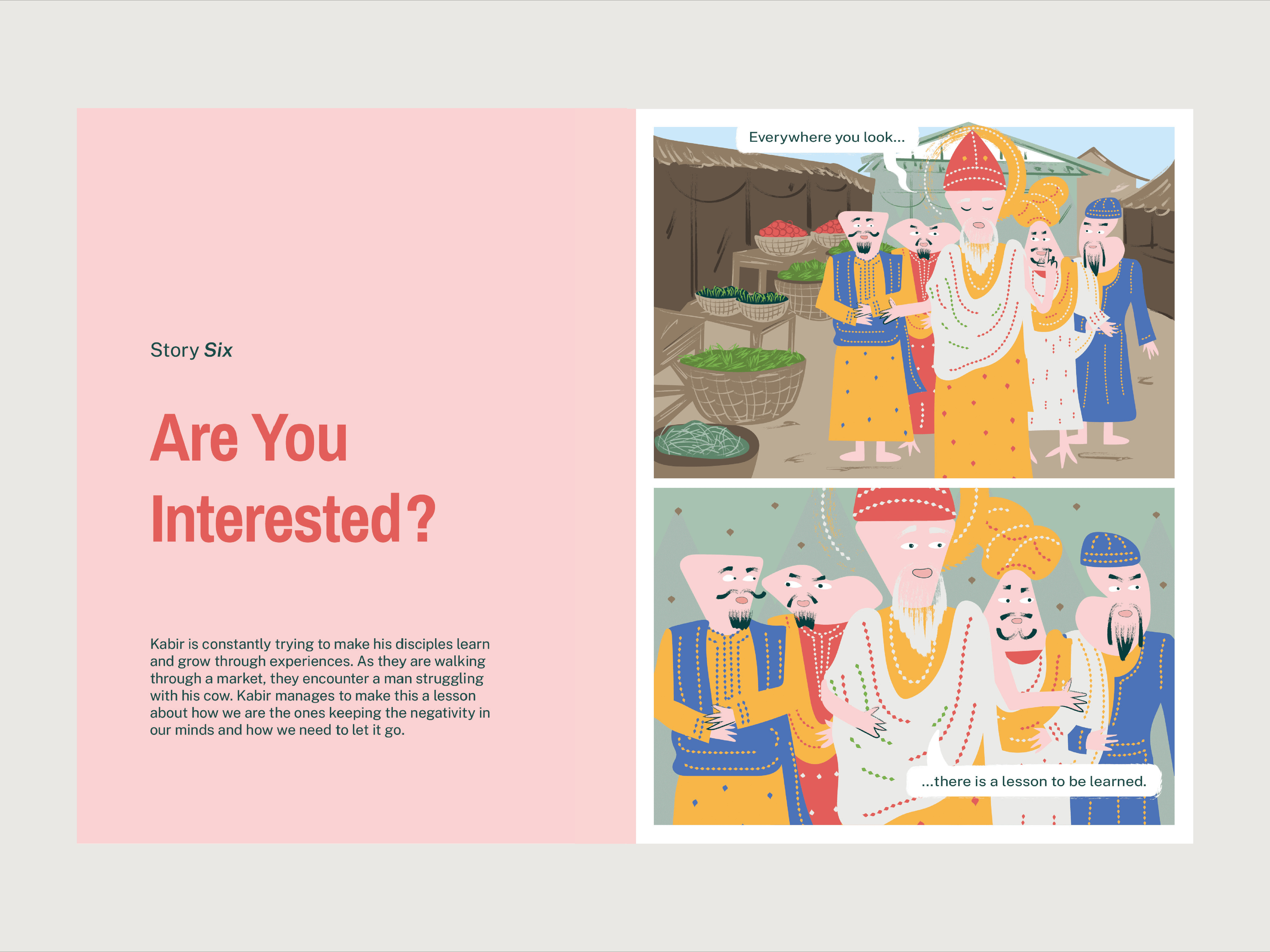
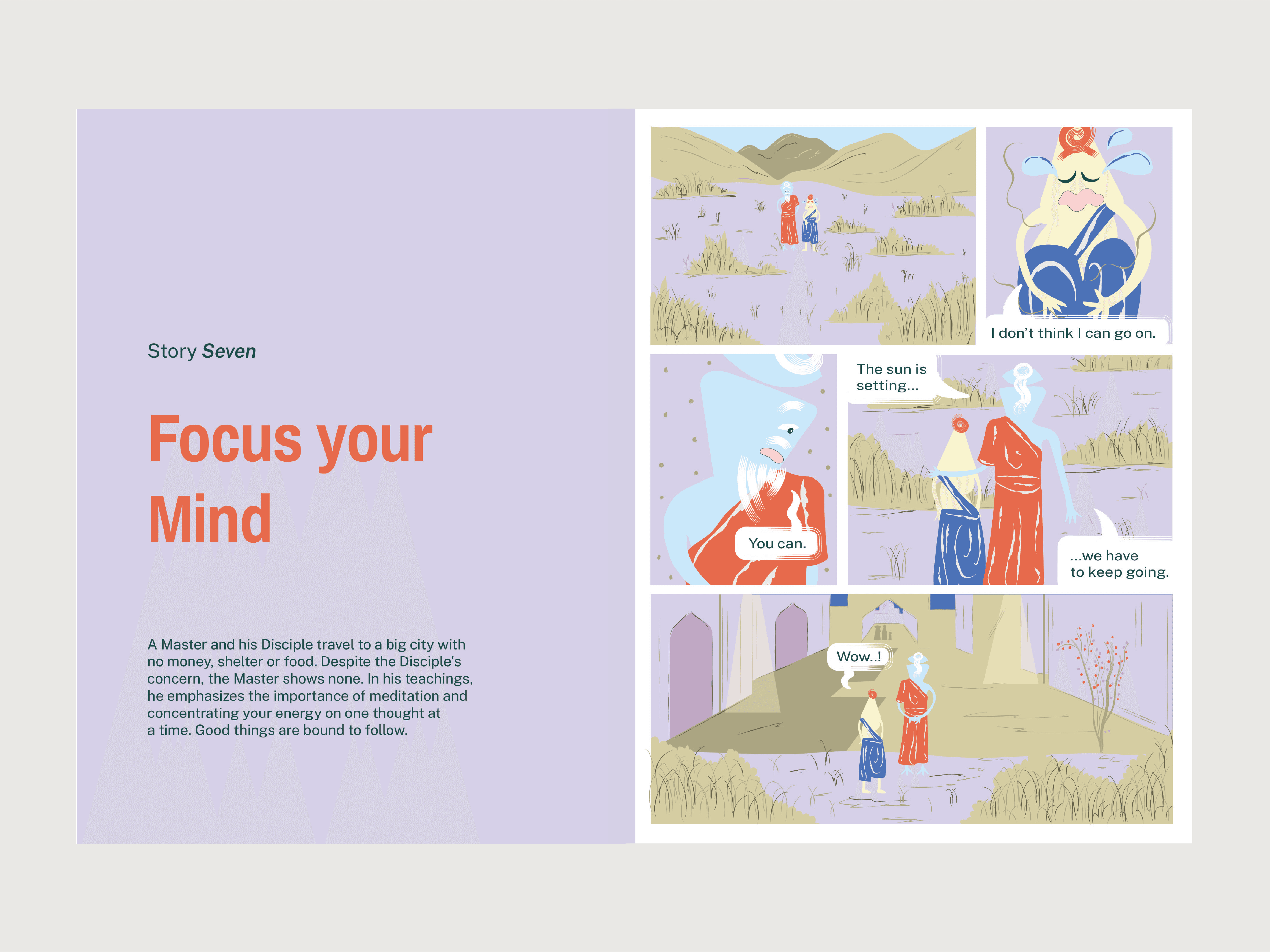
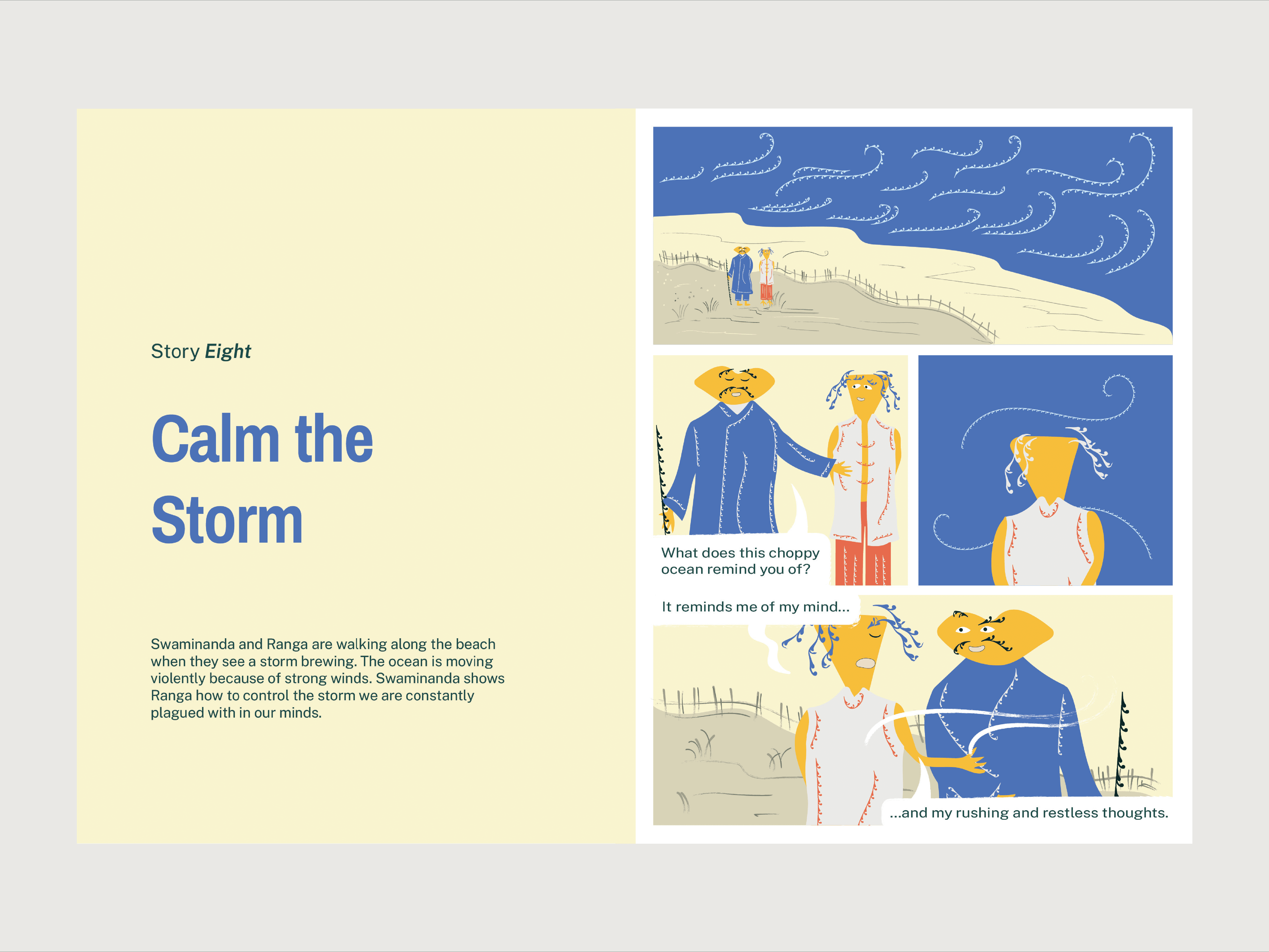
The illustrations translate mindfulness into small, relatable stories that feel approachable, playful and emotionally resonant. Each one captures a feeling, moment or state of mind through simple compositions and symbolic imagery. The visual style combines childlike curiosity with quiet reflection. Building on the mascot system, hand-drawn textures, imperfect lines and organic shapes make the illustrations feel warm, human and tactile. The simplicity of the characters allows viewers to bring their own feelings and interpretations to each scene
Illustrating Mindful Stories
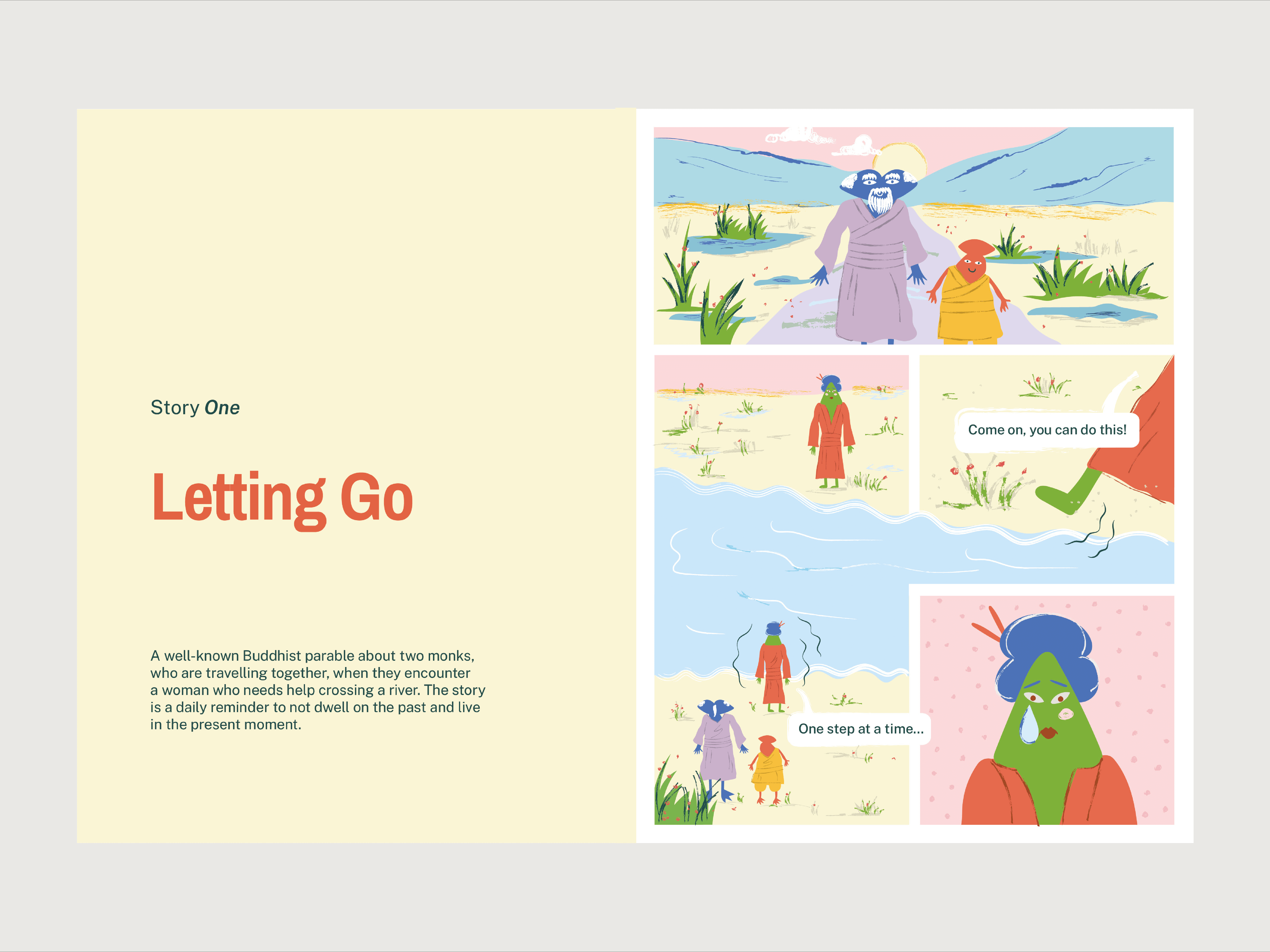
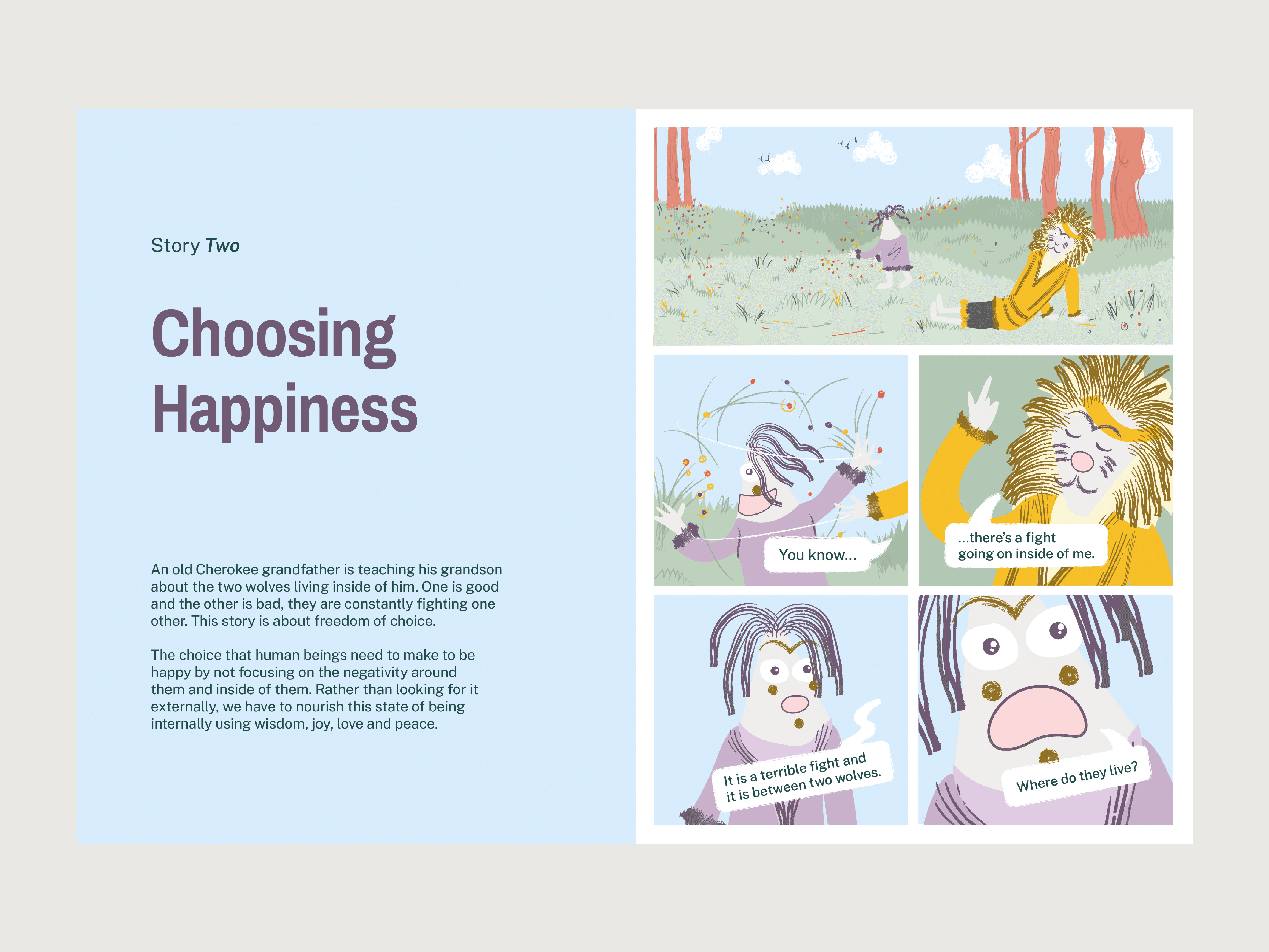
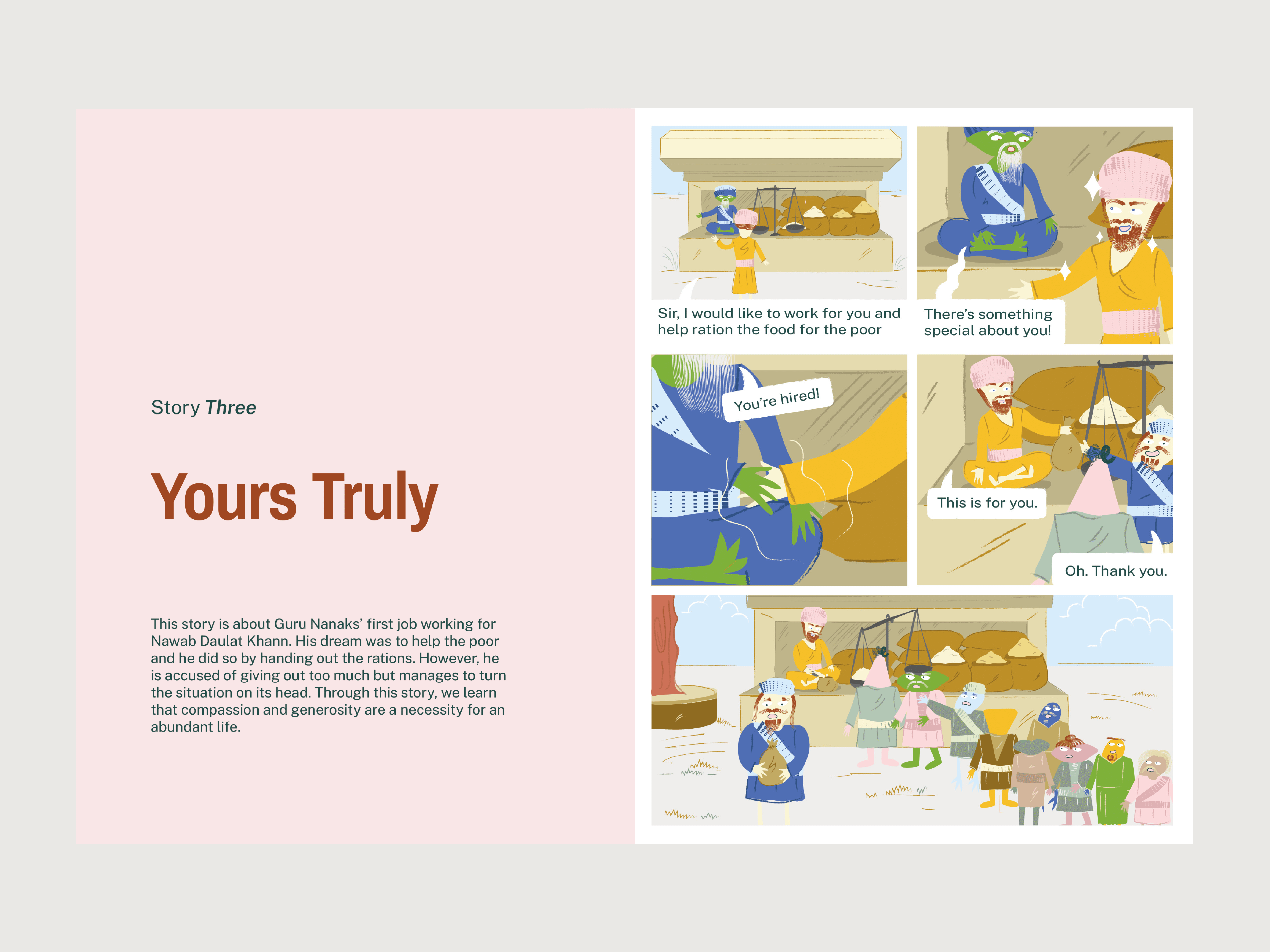
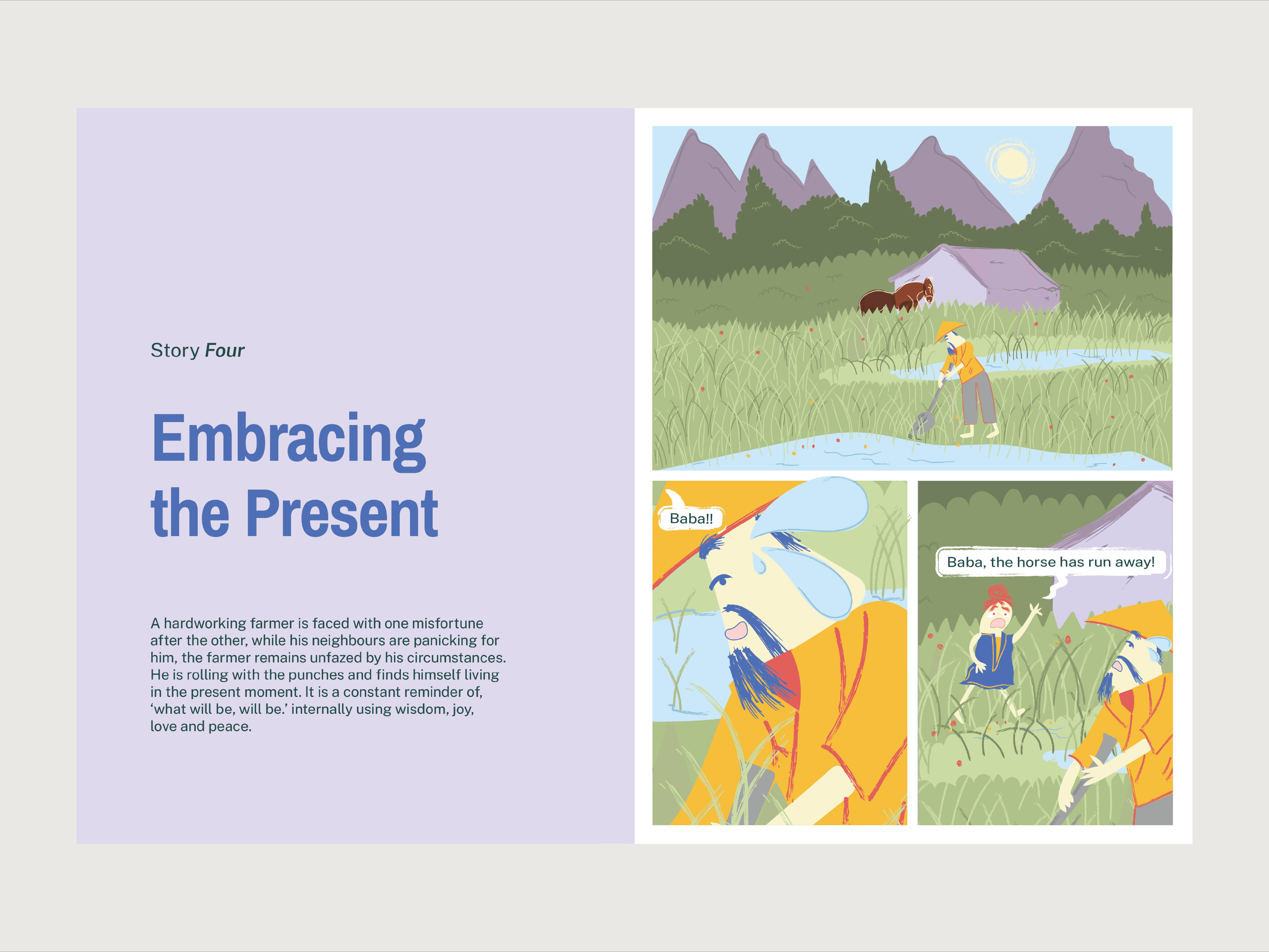
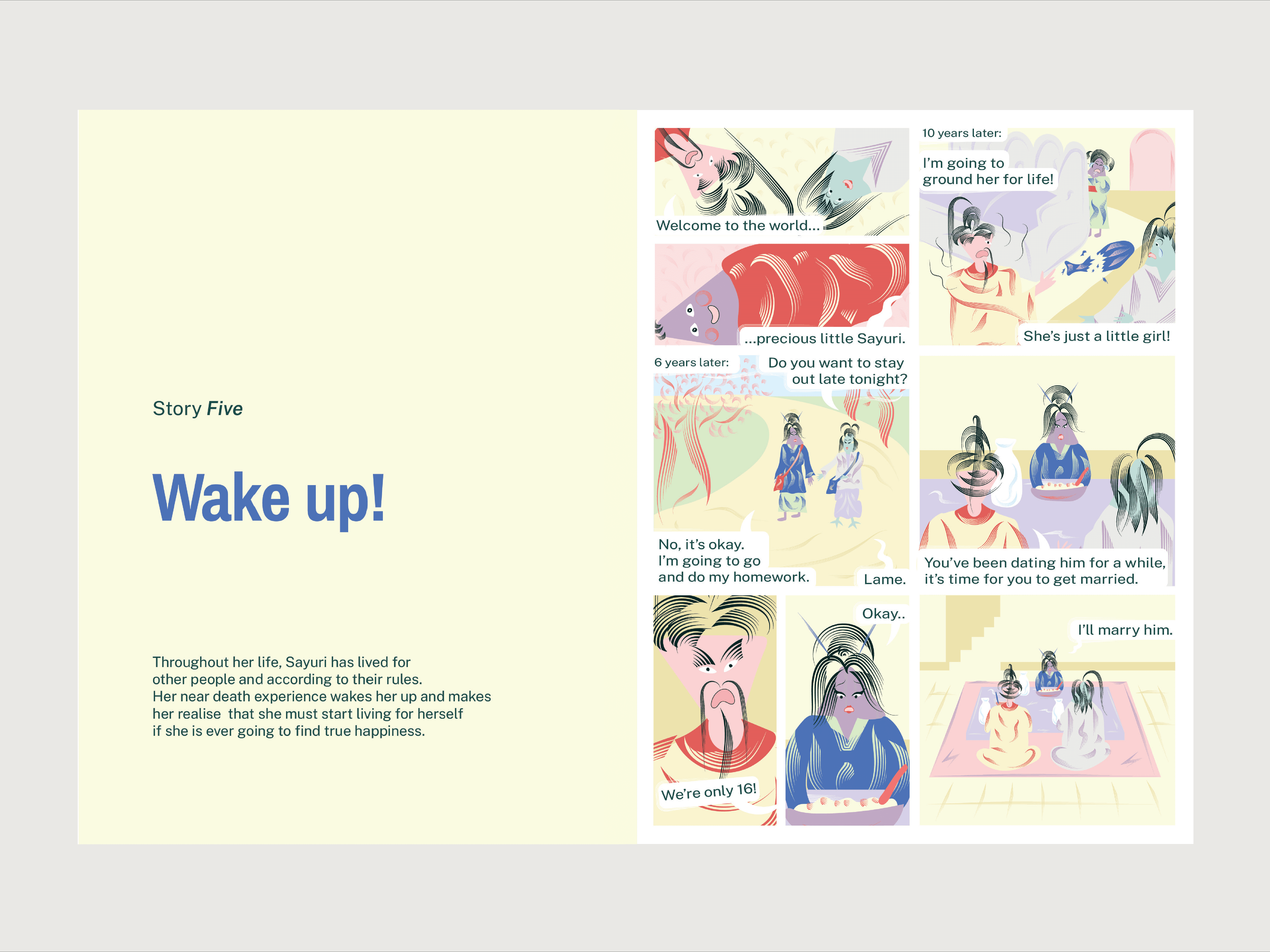
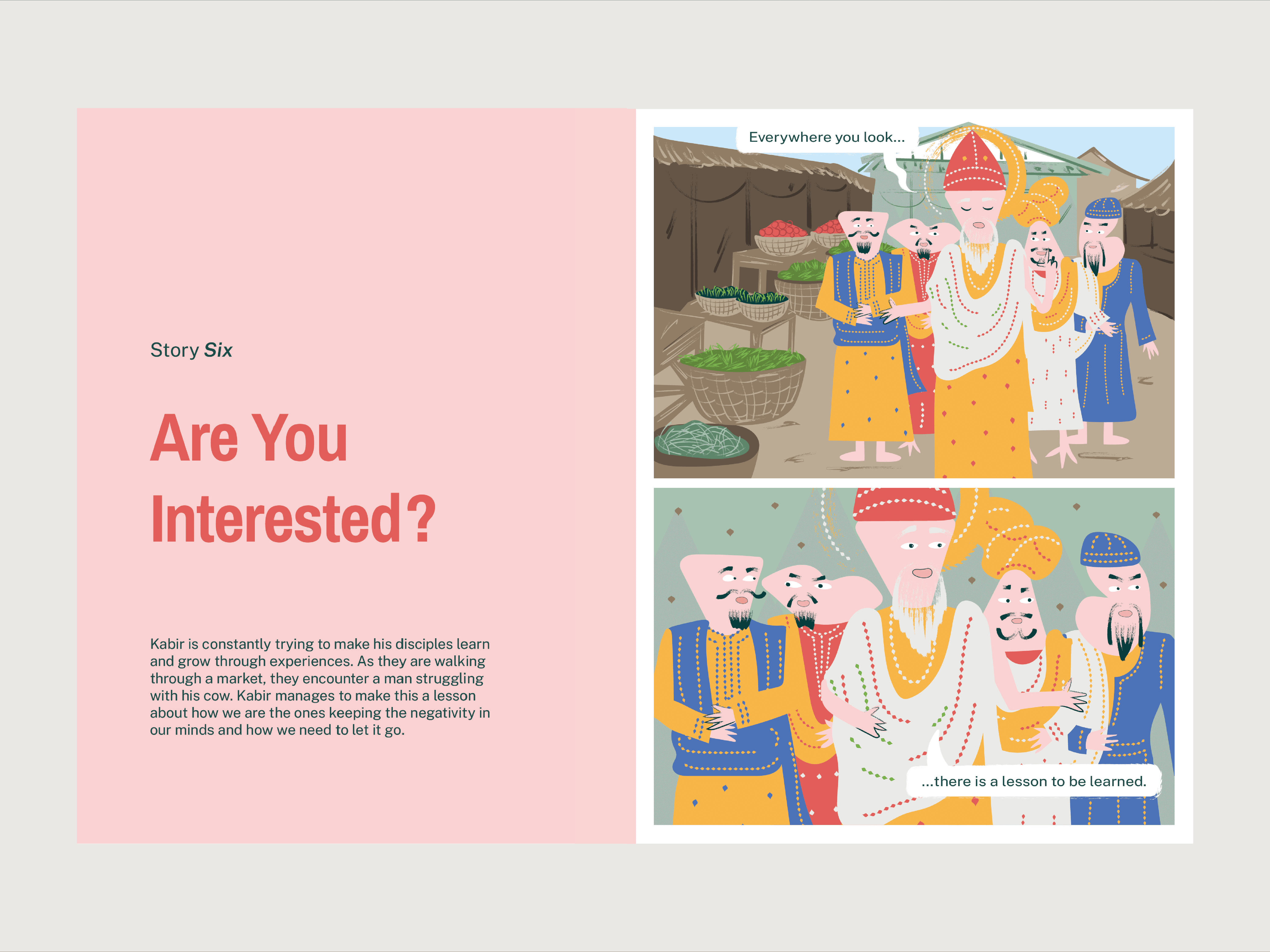
Through eight parables from around the world, each narrative explores a different emotional lesson and perspective, encouraging readers to reflect on themes of well-being and self-awareness. While every story unfolds in a distinct setting, the collection remains cohesive through a shared colour palette, recurring visual motifs, consistent character design and a unified emotional tone.
Outcome
The design transformed mindfulness from an abstract idea into something tangible, relatable, and easy to engage with. Through a cohesive visual language of balance, colour, expressive characters and storytelling, the brand found a more playful and human way to communicate moments of reflection, emotional awareness and personal growth.
Thanks to
Anushkha Advani, Kritika Arya, Rhea Shanghvi